| Image |
Comment |
| 10/29/2003 08:22:01 AM |
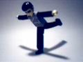
Burning Heartby vienComment: This is an interesting abstract and I do like the intense colors, but the photo fails to generate any emotional response from me. It is perhaps technically sound but I am having a very hard understanding your interpretation into the challenge. For my own personal taste, I prefer the picture speak for itself rather than having to wait for the end of the challenge or a PM explaining to me what I SHOULD be seeing. FYI, after making these remarks, I am raising the score from what I originally gave you since I do see some merit here that, upon first review, I overlooked. I know I have a tendency to be harsher on abstracts which is why I came back to look again. |
 Photographer found comment helpful. Photographer found comment helpful. |
| 10/29/2003 04:08:16 AM |
Mercyby zeuszenComment: Oh wow. What a fabulous photograph this is. The sailboat looks almost ghostly as it fades into (or out of) the fog and the lack of horizon adds a wonderful, mystical feel to it. This is a stunning, moving shot to me. Good luck with the challenge. I hope others see the beauty you have captured here. 10 |
| Photographer found comment helpful. |
| 10/29/2003 03:59:33 AM |
The swallowby madichComment: This would have been better if it were bigger and in better focus. I like the attempt but it's so blurry, it loses much of the humor you were going for. I do like how the shadow looks like a propellor from a helicopter. LOL! This could have been so silly and cool. |
| Photographer found comment helpful. |
| 10/29/2003 03:54:41 AM |
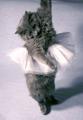
I never thought grace can be so hard....by weird_boy15Comment: Very cute! See what you can do about losing the harsh shadow to the right of the kitty. It's obtrusive and detracts from her...gracefulness. I'd also like to see more of her extended paw. Love the concept though. |
| Photographer found comment helpful. |
| 10/29/2003 03:51:52 AM |
|
| Photographer found comment helpful. |
| 10/29/2003 03:49:26 AM |
The Terrible Twos?by christianComment: What a charming shot this turned out to be. Too bad the tip of the toes were cropped off, but I like the yellow tint to the shot, giving it an "old fashioned" feel, and the character of the aging wall is as nice a contrast to the youthfulness of this child as the softness of the courtain is a nice comparison to the softness of her young skin. I like that she's looking down and not at the camera. She looks like she fell asleep taking a break from her melee of mischief! |
| 10/29/2003 03:41:56 AM |
Graceful Riderby GinaRothfelsComment: I like the detail of the buildings and how perfect it is that the awning has the word "grace" scrolled on it, but your focal point, the bicyclist, gets lost in the shadows, his head disappearing so completely he seems almost like the Headless Bicylcist. I know I have a bit of a problem with the darkness of my monitor but I think even on a better monitor he would still not stand out against those shadows as you may wish for him to be. |
| Photographer found comment helpful. |
| 10/29/2003 03:39:12 AM |
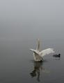
Reflecting Ritualby ellamayComment: I would like this better if the little mallard duck had swum away just a little sooner so he wasn't in the shot. The swan is terrific and your ability to stop the action of his flapping wings is very well done. I love the placement within the frame so that you can see all of his reflection to the bottom and the gradation of dark to light as you look up. Beautiful shot. |
| Photographer found comment helpful. |
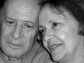
| 10/29/2003 03:35:55 AM |
Growing Old Gracefully...by basia03Comment: This is a nice shot of this couple but, if they're posed and knowing they're getting their picture taken, dapple their faces with some light powder to take away that shine. They look like they're sweating profusely and it is a terrible distraction. I also think cropping the gentleman's face so close to the border so that his cheek seems cut off should be reconsidered. I love the concept within the challenge theme and with a little tweaking, this would be a great shot. |
| Photographer found comment helpful. |
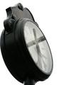
| 10/29/2003 03:26:48 AM |
Time: reflecting His graceby BotKeeperComment: Interesting concept. I think it would be even more effective if the horizontal beam of the cross didn't stretch the whole span of the clock face. I like the black and white and the solid white backdrop which really emphasizes your focal point and you have very nice clarity of the details in the face. Perhaps crop it so that you have just of white behind the clock so that it doesn't butt up so precisely to the border. |
| Photographer found comment helpful. |
Home -
Challenges -
Community -
League -
Photos -
Cameras -
Lenses -
Learn -
Help -
Terms of Use -
Privacy -
Top ^
DPChallenge, and website content and design, Copyright © 2001-2025 Challenging Technologies, LLC.
All digital photo copyrights belong to the photographers and may not be used without permission.
Current Server Time: 04/18/2025 03:59:44 PM EDT.