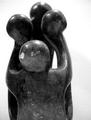
DPChallenge: A Digital Photography Contest You are not logged in. (log in or register
 
Browse Settings
Currently viewing:
Registered Userjoannadiva

Show comments:

Per page:

Order:

Comments:


Comments Made by joannadiva
Pages:   ...
Showing 31 - 40 of ~300
Image Comment
Coffee in the Morning
11/26/2003 12:30:54 PM
Coffee in the Morning
by newtune3

Comment:
Nice still life.
Great all purpose light not to harsh yet everything is clear
Looks tilted and I would have preferred a tighter crop also could have fixed the tilting.
Photographer found comment helpful.
FESTIVE SMELL
11/26/2003 12:28:06 PM
FESTIVE SMELL
by RUEDISCHMUTZ

Comment:
ROTFL...
Great concept, focus, light, etc.. 10
Fresh baked bread
11/26/2003 12:26:56 PM
Fresh baked bread
by Dave Gordon

Comment:
Nice use of the morning sun. but it looks a little blown out. next time try underexposing inthe cam and then boosting the levels in post prossesing.
Photographer found comment helpful.
de-odorizers
11/26/2003 12:25:13 PM
de-odorizers
by rogerspaul

Comment:
Your cans all seem oddly tilted and your ashtray is soft and blown out at the same time.

Sugestion next time try shooting the cans streight on and tilt the ashtray a bit also use some ashes to dull the shiny surface of the ashtray.

I'm asuming you have an entry level cam but you can still experement with DOF try setting up the shotwith the ashtray about 1 to 2 feet in front of the cans. Prop and prep the ashtray. And play with using your cameras autofocus to pick up the ashtray with the cans in the backgrownd and another shot with the cans in focus and the ashtray in your foreground.

Remember to keep your light difused but bright if need be under expose and boost brightness in post prossesing.

Good luck
Photographer found comment helpful.
Mirrored Scents
11/26/2003 12:15:51 PM
Mirrored Scents
by qwerty_314

Comment:
Mirroe shots are so dificlt there is always dust on the miror somewhere.
Nice play of color
New Crayons
11/26/2003 12:11:45 PM
New Crayons
by stargazer

Comment:
At first I was tempted to coment that this dose not meet the challenge however your pic broght back a reminiss of childhood. Most easter sundays my Grandmother would buy me a new supper box of crayons. it would ber included in my basket with a colloring book that would take the place of the candy that would give me the uncontrolable sugar HADD's I can remember the smell of all that fresh wax like it was yesterday. This is so subtle but right on the money.

as for the photography portion

Negitive:

Size too small
When resizing in what ever program you use try making sure the largest side of your pic is at least 600 pixels long. There are several threads on this kind of thing. if you can't find one post one of your own. wiser minds than mine can help you.
Lack of sharpness
You may want to try this on a tripod or some kind of stable surface but it looks like there was sufficint light to produce a sharp image. My sugestion is your focus is off. Try Macro mode if your camera has that feature.
Blow out and bleed on the colors especaly the white crayon
Try difusing the light some. I use drier sheets over my lights afixed with a embrodery hoop.Makes the house smell april fresh too.

Positive:
Very creative and subtle!!
Wonderfull use of color
Nice example of how to fill the frame
Photographer found comment helpful.
Wailin' the Blues
11/22/2003 08:55:26 AM
Wailin' the Blues
by KarenB

Comment:
Nice. How did you do this???? Blue screen in front and backlight??? or something else.
Photographer found comment helpful.
Circle of Family
11/21/2003 04:59:12 AM
Circle of Family
by WILDBLUE

Comment:
Greetings WILDBLUE from the critique club,

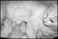
On the negative side the statue is nice but the photo doesn't bring much to it. The statue is neither centered or dose it follow any kind of "rule of thirds " ratio and therefore strikes me as random and sloppy giving no clear focal point and therefore no clear intent to the viewer. Perhaps a tighter crop on the heads creating a circle give the viewer the impact and idea of the "circle of family"

The overhead lighting is a bit harsh causing blowout on the tops of the heads (but I might be a little picky here) but lack of illumination in the heart of your circle leaving no definition of detail. Perhaps softer diffused overhead and side lights, and/or a creative use of a maglight in the center of the statue might have given you better detail over all.

On the positive side I like your use of DOF here your intent may not have been to create the idea of the circle viewed from the smallest member otherwise you might have used a steeper angle but you get the point that the "Child" is the most important member of the circle.

I also like the dramatic use of B&W in a case like this YES!!!!

Design calls for you to see the shapes and not be confused by color the white back drop works well for this as to give more stark definition of subject.

Hope you find this helpful and not discouraging my critique is a little harsh but this is not up to the standard of your other work Any questions feel free to contact me.

Blessings
jo
Photographer found comment helpful.
kj3.1.jpg
11/20/2003 07:14:29 PM
kj3.1.jpg
by buzzrock

Comment:
awwwwwwwwwwwwwwwwwwwww
Photographer found comment helpful.
Proud mom
11/19/2003 11:03:28 PM
Proud mom
by heida

Comment:
What a beautifull family you have there
Photographer found comment helpful.
Pages:   ...
Showing 31 - 40 of ~300


Home - Challenges - Community - League - Photos - Cameras - Lenses - Learn - Help - Terms of Use - Privacy - Top ^
DPChallenge, and website content and design, Copyright © 2001-2025 Challenging Technologies, LLC.
All digital photo copyrights belong to the photographers and may not be used without permission.
Current Server Time: 04/09/2025 12:46:31 PM EDT.