| Image |
Comment |
| 06/06/2003 09:18:59 PM |
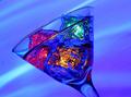
Technicolor Martiniby scab-labComment: I like this on two levels - first, the lighting / colors (how did you get those to work so perfectly - are the cubes themselves colored, or...?). But also the composition. My first response was "just gorgeous, just perfect," and analyzing it, I think it's because you managed to touch on the 2/3 height & width, and 1/3 height and width, with the "upper" corners of the glass, balancing the picture with the glass itself without just framing it square on. Really attractive. |
 Photographer found comment helpful. Photographer found comment helpful. |
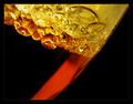
| 06/06/2003 09:16:48 PM |
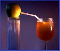
Transfusionby moodvilleComment: This was good for a definite laugh - somewhere in the midst of the appreciation. Besides being funny and original, this shot is really well-balanced - I like the way you've placed the objects, splitting it across, but not bound it to being the same height on both sides. It works really nicely - and the lighting is well-placed, too, setting focus on the joining and the liquid more than on the support case of straws, without obscuring them. Nice shot. |
| Photographer found comment helpful. |
| 06/06/2003 09:11:54 PM |
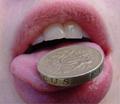
what I drinkby BeckyComment: I like the concept, but you got yourself and the camera in the shot, by way of the reflections, and a fair bit of glare reflection off to the right - it might have been worth trying some different angles, shooting high or low, or blocking some of the light if you could. |
| 06/06/2003 09:10:49 PM |
|
| Photographer found comment helpful. |
| 06/06/2003 09:10:12 PM |
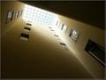
Interior Buildingby britesantosComment: Really cool concept, though I'm not sure if I buy it as liquid. I wonder what it would have looked like with one edge (Somewhere) straight to an edge of teh photo, or at a 45 degree angle...as it is, they don't seem to quite square off with or strike against the edges, and I wonder if it might have heightened the drama. |
| 06/06/2003 09:08:02 PM |
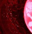
Bloody Splashby alternaruleComment: I have trouble making this one out, I think because the left side looks awfully granular for liquid - so that I wonder what it is - and because the dish (?) at the right side being so bright, the left side is dark and seems a bit off. Maybe it wouldn't if I'd seen the original scene. |
| Photographer found comment helpful. |
| 06/06/2003 09:06:46 PM |
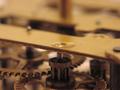
Oiledby jjimComment: I would have liked to see the oil, to have a sense of something liquid in the picture, and it seems like you let your focus land so tightly in the foreground that even most of the second gear is blurred, and the upper half of the picture is blurry enough to be highly distracting. I like the concept of the shot, but I'm not sure the angle/focus/crop/something was quite right. |
| 06/06/2003 09:05:02 PM |
Opposite reactionby BJComment: I'm wondering what this is - I'm afraid the title doesn't clue me in, either. Nice colors, but that's about all I'm sure I know about it. |
| Photographer found comment helpful. |
| 06/06/2003 08:04:29 PM |
|
| 06/06/2003 07:51:55 PM |
Oil & Vinegar Abstractby jerrftComment: Very cool effect - I like both the choice of subject and the way you positioned this photo, the angles and placement are gorgeous. |
| Photographer found comment helpful. |
Home -
Challenges -
Community -
League -
Photos -
Cameras -
Lenses -
Learn -
Help -
Terms of Use -
Privacy -
Top ^
DPChallenge, and website content and design, Copyright © 2001-2025 Challenging Technologies, LLC.
All digital photo copyrights belong to the photographers and may not be used without permission.
Current Server Time: 04/13/2025 10:23:58 AM EDT.