|
|
|
Showing 321 - 330 of ~372 |
| Image |
Comment |
| 06/14/2003 09:00:58 AM | Fashionby TonesOfGrayComment: The lighting on this is so harsh - the glare on the left side is distracting, as is the fogging from it, and it looks like you used a plastic doll from both the pose/angle of the head and the lighting (though I find it harder to believe a doll could achieve that angle of the wrist). I'm not sure what the background was, but it looks like it was at an angle - streaks/striations are visible on it. |
| 06/14/2003 08:58:20 AM | Model Of The Month (Cosmo)by AmieeComment: I don't find the pose especially believable, but my bigger concern with this photo is that you've let the background take over. Even though your subject fills most of the frame, the background's not significantly more blurred - and weeds, a plastic trash can, the edge of a picnic table, the building's roof slanting down into the picture - it's all very distracting/cluttery. A different place and background might have strengthened this image a lot (either blurring the background out, finding something restful, or using a background of more intrinsic interest/excitement so that it was part of, rather than an intrusion on, the feel of the image). |
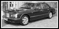
| 06/14/2003 08:55:00 AM | Top Gearby trishComment: A nice black and white - the building in the background is distracting, especially at the left side, but I don\'t see how you could have blurred it out without also losing the crispness on the car itself, which would have been a poor trade-off. This might be hard to fit on a cover, unless they frame it above and below with dead space or use it as a smaller accent picture. |  Photographer found comment helpful. Photographer found comment helpful. |
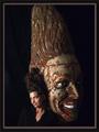
| 06/14/2003 08:52:38 AM | conehead digestby grigrigirlComment: Does that magazine exist? Very interesting visual effect, though; it seems a pity the top of the statue (?) is cut off. | | Photographer found comment helpful. |
| 06/14/2003 08:51:40 AM | Great Break Timeby kposeyComment: This looks like a photo of a magazine, rather than for a magazine. It's well layed-out for what it is, but it doesn't seem to meet the challenge. |
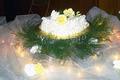
| 06/14/2003 08:49:15 AM | Cakeby Crafty SueComment: The foreground on this one is very pretty; I would like the shot better if the backdrop were better controlled, and the photo was even. With the focus on the cake, it would help if it were horizontal in the photo (or further off the horizontal, if the sloping is deliberate) - as it is, it's clear that it angles (since it's so close to the top of the picture) but looks accidental. The folding chair or stepladder (can't tell which) in the background really stands out as well. The same shot might have worked better if you'd brought a chair or two (or something) close in behind the cake, and draped them with a length of fabric in a suitable color (maybe dark brown or black, here) to prevent the background from intruding on the effect. |
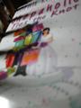
| 06/14/2003 08:46:45 AM | Shopaholicby URBANREMIXdotCOMComment: Was this meant to have the title of a book-review magazine? Since it seems to be a photo of a book, and I don't see a corresponding magazine. It would work okay for that, if it weren't also awfully blurry - it looks like your camera focussed on the bits of furniture (or whatever they are) in the upper left, instead of your subject. |
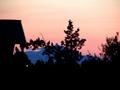
| 06/14/2003 08:44:35 AM | In between somewhere..by Michael_Comment: The silhouettes would be a nice effect - you have it set up to be very powerful, as far as how you framed the image, but everything's blurred. Was this a slow exposure? The smudging of edges is something I see on my slow exposures when I move a bit. It really detracts from the image, making it strain the eye a bit to look at it, unfortunately. |
| 06/14/2003 08:42:26 AM | Rubber Loverby ish36Comment: I've never heard of this magazine in my life (and a quick internet search didn't turn up a magazine with that title). I'm not sure what this is (besides, presumably, made of rubber?). It could use either better focus or better lighting, though - I'm not sure which, but the whole picture looks blurry to me, too soft. |
| 06/14/2003 08:40:29 AM | Garden Designby DennisFComment: Nicely dramatic - good, vivid colors, and the use of the black background brings it out nicely. I like that it's off-center and cut off to the left, and I have no idea exactly why that works so well, but it does. | | Photographer found comment helpful. |
|
Showing 321 - 330 of ~372 |
Home -
Challenges -
Community -
League -
Photos -
Cameras -
Lenses -
Learn -
Help -
Terms of Use -
Privacy -
Top ^
DPChallenge, and website content and design, Copyright © 2001-2025 Challenging Technologies, LLC.
All digital photo copyrights belong to the photographers and may not be used without permission.
Current Server Time: 04/13/2025 10:23:57 AM EDT.
|