| Image |
Comment |
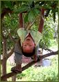
| 06/29/2003 07:42:51 PM |
Growing upby InnaNComment: This is a lovely shot/idea for this challenge. I think if the focus were a touch sharper on the boy's face (it looks like perhaps the branch beneath his feet, and his feet, got more focus than his face), and the background weren't quite as bright (not sure how that could be achieved, except maybe fill-and-flash, and maybe not then), it would be stunning. |
 Photographer found comment helpful. Photographer found comment helpful. |
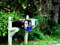
| 06/29/2003 05:28:12 PM |
Rural Free Deliveryby STEINRComment: A nicely-chosen little scene. I think this would be a stronger photo, though, with a different composition - the angle of the mailboxes leads the eye naturally up and right, where it encounters a tree trunk that draws it vertically out of the photo. Cropping to avoid that might have been one option, or varying the angle.
The bright areas in this are also too bright - the all-white mailbox in particular seems to have no real detail to it, being washed-out by the light. |
| Photographer found comment helpful. |
| 06/29/2003 05:18:20 PM |
Little Forest Cottageby MonaComment: I like the composition on this one - the way the wellhouse brings it forward, especially. The brightest areas (sky, and adjacent trees) are too bright, blurring details, but I didn't notice that at first glance, since the color contrast of the red to green draws the eye back and back to the intended center in this photo. Overall well-done - and a pretty little scene, well-chosen! |
| Photographer found comment helpful. |
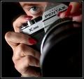
| 06/28/2003 09:02:53 AM |
Photographerby jodiecostonComment: This is really striking - I like the black background, the sharp focus on face/hands/body of the camera. |
| Photographer found comment helpful. |
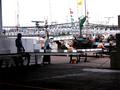
| 06/28/2003 08:54:19 AM |
unloading a morning catchby kenboComment: This is a very busy scene - distractingly so. The lights (is that what they are?) draw my eyes away from the workers, 2 of whom are solidly in shadow and harm to make out in any case. I wonder if it could have been tightened in with a smaller crop, perhaps around the one person who is clearly-lit, at the end of the conveyer. |
| Photographer found comment helpful. |
| 06/28/2003 08:50:16 AM |
Employee Theftby ClubJuggleComment: Nice capture of motion - very crisp. I like the way you've given a portion of the picture over to the dust, so that the eye tracks along the same path he followed to the base. |
| Photographer found comment helpful. |
| 06/28/2003 08:49:10 AM |
In The Saddleby RuchartComment: I like this one - the angle chosen is creative, and the picture is nicely held by the horse's head and the man's head. His hat glows a little, but I'm impressed that his face is as clear as it is under that. |
| Photographer found comment helpful. |
| 06/28/2003 08:48:10 AM |
34th & 8thby MarkS224Comment: I like the subject - it seems like the background is too in-focus, possibly more so than the subject, and because it's so busy it's very distracting. |
| Photographer found comment helpful. |
| 06/28/2003 08:46:23 AM |
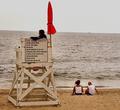
On Dutyby JB707Comment: It's a pretty beach. I think this picture could have been a lot stronger - the focus is a bit on the thin side (heavily underlined by the blurred words on the sign - and when I go searching for what is in focus, I can't find it), and the life guard is so shadowed it's hard to see details of his face (probably in part focus, but also the lighting there is overwhelmed by light off the water behind him).
It might have been worth playing with a sharping mask or trying to get a clearer shot to start from, and lightening it a little (although the difference between the lifeguard and the tower he's sitting on might have made that difficult to do without making the structure glare). |
| Photographer found comment helpful. |
| 06/28/2003 07:43:21 AM |
W. Farrell Edwards-Bright Mind for Physicsby sagestudioComment: I like this, but I'd like it better with different lighting, I think. As it is, my eye goes to the blank part of the paper (where the light hits it) and to the subject's hair - rather than to his face or hand, or the writing, which are more shadowed. |
| Photographer found comment helpful. |
Home -
Challenges -
Community -
League -
Photos -
Cameras -
Lenses -
Learn -
Help -
Terms of Use -
Privacy -
Top ^
DPChallenge, and website content and design, Copyright © 2001-2025 Challenging Technologies, LLC.
All digital photo copyrights belong to the photographers and may not be used without permission.
Current Server Time: 04/15/2025 12:59:43 AM EDT.