| Image |
Comment |
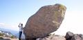
| 08/24/2003 04:55:31 PM |
Feeling Smallby sunflowerComment: This is a really cool use of negative space. It's weakened by several factors, though: the near rocks are straight, but the horizon and even the ground by the boy (to the left) are at an angle; focus could be crisper (I'm not sure what it focussed on); and the light behind the boy glares so much that his hand appears to be patchwork lace. It's a lovely setup, and I suspect a few more angles and different exposure times would have produced a crisper show of what you were trying to do with this one. |
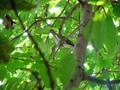
| 08/24/2003 04:53:21 PM |
Palomaby amonteforteComment: This is a pretty scene, and a nice capture of the bird. The tree has too much variance - and too much of it in focus - to work well as negative space, though, especially with the daylight glaring through the spaces. |
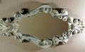
| 08/24/2003 04:52:20 PM |
Mirror or a frame?by jab119Comment: This is an interesting photo. I think it migh have been stronger if either both ends of the mirror were cut off, or neither was; the harsh lighting at the right-hand end weakens that piece of the picture a bit, so I'd lean toward cutting off both to try to control it a bit, perhaps. |
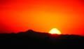
| 08/24/2003 04:50:39 PM |
Red Sunriseby cimarron98Comment: Very pretty colors, but maybe a bit over-exposed - the sun has burned in interesting colors, and the edges of things are blurry, as if there might have been some camera shake? |
 Photographer found comment helpful. Photographer found comment helpful. |
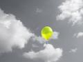
| 08/24/2003 04:46:44 PM |
Aloneby rickhd13Comment: Selective desaturation? Used to very good effect - the balloon is doubly striking for being the only bit of color present. |
| Photographer found comment helpful. |
| 08/24/2003 04:45:18 PM |
|
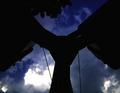
| 08/24/2003 04:42:55 PM |
Come on dear, we're lateby johnmkComment: I really like what you've done with this - the way the space takes over, dwarfs your subjects, leaving them isolated and a bit lonely. This is a very strong image and there's no way it would work half as well without all of the space and distance. |
| Photographer found comment helpful. |
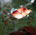
| 08/24/2003 10:19:04 AM |
Just Floating Alongby boyte1Comment: A lovely interpretation and use of negative space - I like the crisp detail of the water's deformation around the leaf. |
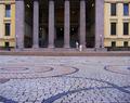
| 08/24/2003 10:18:37 AM |
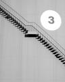
10,000,000 litresby hortopthComment: A nice use of negative space, and very striking. Side of a water tower or the like? At the same time that the number makes that clear, I could almost wish it weren't in the shot, as it distracts from the lines of the staircase. This is still one of my favorites from this challenge. |
| 08/24/2003 10:04:21 AM |
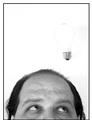
Not a Bright Ideaby moodvilleComment: I like the idea here, but it's so bright the shape of the bulb is almost lost. Is that an accident, or was there a bit of string or the like that had to be washed out also? It's very distracting and I think the picture would be much stronger if the bulb were slightly more defined. |
| Photographer found comment helpful. |
Home -
Challenges -
Community -
League -
Photos -
Cameras -
Lenses -
Learn -
Help -
Terms of Use -
Privacy -
Top ^
DPChallenge, and website content and design, Copyright © 2001-2025 Challenging Technologies, LLC.
All digital photo copyrights belong to the photographers and may not be used without permission.
Current Server Time: 04/13/2025 10:26:30 AM EDT.