| Image |
Comment |
| 05/22/2003 03:47:30 PM |
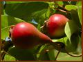
Simple Beautyby GolferDDSComment: Far too much green to capture the point elegantly. Better might have been red blooms in that vase, though of course the leaves themselves count -- maybe a neutral vase? But a nice, arty shot, I suppose. |
 Photographer found comment helpful. Photographer found comment helpful. |
| 05/22/2003 03:46:29 PM |
|
| Photographer found comment helpful. |
| 05/22/2003 03:45:02 PM |
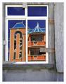
New house on the blockby JeanComment: My, yes, that certainly does qualify as complementary in terms of colour, but that is not a building I would want to look at regularly. It is, however, a good photo of it. The framing, I think, is somewhat distracting from the topical colours, as it's very bright, but artistically it's a nice touch. |
| Photographer found comment helpful. |
| 05/22/2003 03:43:02 PM |
Pastel complimentsby ploogieaComment: Huh. Most of the non-intense coloured photographs so far have left me feeling like they missed the topic, but this one works somewhat better for some reason. The pink stands out very well against the pale yellow-to-green, which suggests you've hit the proper colour contrast. Very well done. |
| Photographer found comment helpful. |
| 05/22/2003 03:40:09 PM |
Mowby rickhd13Comment: Excellent! Red, green, and the nice neutrality of black, no distractions, and a natural-looking snapshot. |
| Photographer found comment helpful. |
| 05/22/2003 03:39:30 PM |
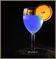
A Good Mixby RuchartComment: Blue Curacao, by any chance?
Very nice, and something I haven't seen yet this round. I like choice of light direction as well; it nicely higlights the colours without introducing any real distraction. |
| Photographer found comment helpful. |
| 05/22/2003 03:37:28 PM |
Hemlock Gorgeby salparadiComment: This is interesting looking, but it is both rather too homogenous of spectra nd not intensely complementary enough to fit the topic well. |
| 05/22/2003 03:36:17 PM |
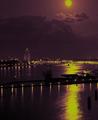
Moonlight over the harborby johnmkComment: This is very lovely but I'm afraid that despite the purple tone it doesn't register as sharply complementary to me. |
| 05/22/2003 03:35:24 PM |
Morning Lightby falveyComment: This is a lovely picture, and the coluor combination is certainly attractive, but the shade of the purple is not quite as obviously 'complementary' as a redder tone would have been. |
| 05/22/2003 03:33:16 PM |
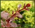
Rain dropsby pitsamanComment: Probably more to lighting than anything, the green colour in the background is more yellow than makes the best complementary colour setup for this. A more vivid background would have suited that better. Also, the blur in this case is rather distracting, even though I understand the desire to focus finely on the droplets. |
| Photographer found comment helpful. |
Home -
Challenges -
Community -
League -
Photos -
Cameras -
Lenses -
Learn -
Help -
Terms of Use -
Privacy -
Top ^
DPChallenge, and website content and design, Copyright © 2001-2025 Challenging Technologies, LLC.
All digital photo copyrights belong to the photographers and may not be used without permission.
Current Server Time: 04/18/2025 03:56:45 PM EDT.