| Image |
Comment |
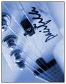
| 06/11/2003 02:10:41 PM |
guitaristby deceptiveComment: Maybe a bit much on the blur here, even given a focus on the tuning. Topically it seems apt. The toning seems a little strange. I think being able to read the logo more clearly might be nice; at that angle I have to twist my head. But it would depend partly on the focus of the cover story. |
 Photographer found comment helpful. Photographer found comment helpful. |
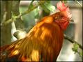
| 06/11/2003 02:09:02 PM |
Birder`s world magazineby marboComment: Hmm... well, I see "birder's world" and for some reason I think of birdwatching -- no clue about the magazine itself. And I don't think of roosters as terribly bird-watching material.
Assuming a NON-full-bleed magazine, it'd be a good shot; focus clear on the bird, background not intrusive. In a full-bleed, you'd have some problems with the brightness of the colours vs copy text, but it might be manageable. |
| Photographer found comment helpful. |
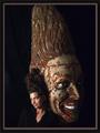
| 06/11/2003 02:07:32 PM |
conehead digestby grigrigirlComment: Okay. The magazine appears to be made up, which is a shame. (Dubious title, and no result on google.) I wish you'd have come up with an existing magazine to go with it, but I'll give you credit for humor.
The shot is kind of interesting, real vs statue, though I don't know what the heck the topic of the cover story would be.
I think it would have been better to have either a different background or a different colour shirt; the shirt has a tendency to try to fade into the bg though I can see the line of the arm.
There's room for cover logo and copy. Assuming a full-bleed shot and the right colour copy it would work fairly well. |
| Photographer found comment helpful. |
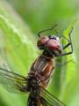
| 06/11/2003 02:04:25 PM |
National Wildlifeby amandolinComment: Hmm, assuming a special on bugs, okay, that makes sense with the title. I don't know your magazine well enough to judge how likely this is, so I'll leave it be.
It's an interesting close-up, though I'm not sure I would have chosen to crop so much of the wings out. The focus is fairly good, seems to blur a bit more at the bottom than I think ideal. The crop is very good to account for cover copy and logo, and the focal blur helps with that. Maybe just a -touch- on the bright side. |
| Photographer found comment helpful. |
| 06/11/2003 02:02:31 PM |
Kids Worldby xertionComment: I don't know the magazine but this seems about right for the title. There's space for a logo at top, that's a plus. A little harder would be cover copy because of the brightness of the light coming between the columns but it could be done. |
| Photographer found comment helpful. |
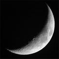
| 06/11/2003 01:58:58 PM |
Sky & Telescopeby Chilly0999Comment: Wow, wow, wow, NICE moon photo.
What's more, the fact that it's that closeup seems to fit your intended magazine nicely; I'm not familiar with it but with a title like that it seems a good bet.
B&W is the right choice here, both because I've frequently seen B&W moons on the cover of magazines and because it makes it so much easier to place copy on the front.
My only potential complaint depends on the layout of the magazine; a closer crop or the use of full-bleed would obscure a section o fthe moon, which would suck. |
| Photographer found comment helpful. |
| 06/11/2003 01:57:24 PM |
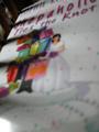
Shopaholicby URBANREMIXdotCOMComment: It kinda looks like this a photo OF a magazine cover, not FOR one.
Aside from that... this is very blurry overall, and there looks to be some striped shadows on the left that obscure things, which for a crop this tight is not good. |
| 06/11/2003 01:56:16 PM |
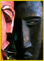
National Geographicby magnetic9999Comment: First thing that struck me was how bright the left face is, which would make it harder to place copy across it (though not impossible); a different crop or angle might have helped with this.
As far as the magazine goes, I could see this on the cover, yes. It's interesting and ethnic-feeling.
LIghting at the top seems slightly bright. |
| Photographer found comment helpful. |
| 06/11/2003 01:15:41 PM |
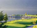
Golf BCby brumosComment: Haven't heard of your magazine but I know there are golfer mags out there so I'm cool with that.
It's a pretty landscape shot that is a little less obviously a golf course than I would have chosen, but the flag in the background does give it context (and of course it would have a different context once cover copy was added). The shot is crisp and clean, it shows off what would probably be a challenging part of a course, from what little I know of golf. The focal blur on the background gives plenty of space for cover copy, as does the reasonable homogenity of the grass. A crop would not ruin it in the case of a full-bleed image. Overall a good job, however little I like golf. :) |
| 06/11/2003 01:13:14 PM |
Martha Stewart Livingby nbortonComment: Slightly more vague than I might have invisioned on a Martha Stewart cover but not out of the question by any means. (By 'vague' I mean the cover art tends to focus on, say, a whole flowerbed or a project involving flowers more than it would a single bloom but that's on limited experience, I admit.)
I like the shot a lot. It's got great colour contrast, and the focal blur in the back makes the ideal backdrop for coverlines. The only place it suffers at all is fitting the logo at the top without obscuring the flower, which is minor; they might choose to continue the green colour up into an added background to compensate. |
| Photographer found comment helpful. |
Home -
Challenges -
Community -
League -
Photos -
Cameras -
Lenses -
Learn -
Help -
Terms of Use -
Privacy -
Top ^
DPChallenge, and website content and design, Copyright © 2001-2025 Challenging Technologies, LLC.
All digital photo copyrights belong to the photographers and may not be used without permission.
Current Server Time: 04/18/2025 04:01:09 PM EDT.