|
|
| Image |
Comment |
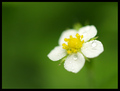
| 05/26/2008 05:00:25 PM | wild strawberry flowerby andrijaComment: *Critique Club*
Hi, my name is Russell and as per your request, this is your critique.
What I liked - Great depth of field, a nice minimalist type of photograph. The many shades of green really help the contrasting colors in the flower.
What I didn't like - The softness of the subject especially the yellow center. I understand that this is a soft focus challenge but the center of the flower is more of a blob, just a touch more focus there would have made a great difference. The rain drops are a great addition, but I think the larger three kind of take away some from your subject. Lastly, there is some jagged lighter green at the top of the flower (most likely a set of leaves of some kind). As is, they are set against a much darker green and really stand out - which also takes away from the subject.
Overall, your photo scored fairly well, it may have scored better if the distractions were gone (mainly the larger drops and the light green leaves mentioned above). After looking at your portfolio, you have a great eye for this type of photography. KEEP IT UP!
Russ |
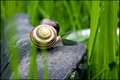
| 05/26/2008 04:06:31 PM | Home Gymby Neilos888Comment: *Critique Club*
Hi, this is Russell and I am performing the critique that you requested.
What I like - This is a great shot of a snail, for the most part anyway. Great lighting and detail on the shell and the dampness of the shell makes it look pretty good.
What I didn't like - Since the challenge had to do with Bicycles I think something recognizable as a bike would have been good. Without the explanation, the seat pictured could be anything from a rock to a log - the viewer needs to know it is a bike seat without the explanation. There are other technical issues - for instance the blades of grass in front of the snail. Though they are blurred well, they still really distract from the snails shell (always a great subject).
Some ways to improve it - change angles and/or move the grass while taking the photo. Just a change of angle may have gotten enough of the seat in the photo to make it recognizable. Since snails are fairly slow and static, maybe even moving it elsewhere (you can always return it when your done).
Lastly, watch when you re-size your photo before posting, when I brought it up in PS, the size was good, but the resolution was just over 28 pixels on your resolution, should be at least 72dpi or better.
Keep working at it, you have some great subjects, just try to remember, in any challenge your photo should be telling the story, not your description (something that is not seen untill after the challenge).
Russ |
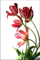
| 05/24/2008 05:42:02 PM | Red-Striped Tulipsby riversongComment: *Critique Club*
Hi!! Russell from the critique club here - lets get started!!
What I liked - Tulips are some of the coolest flowers, so many different colors and great strong stems make them easily posable. Here we have the same, great color and no distracting background to keep the viewer from seeing the flowers. Good composition too.
Problems - Lighting is number one, the bottom flower is so much brighter then the rest (to the point of blown-out in spots) it takes away from the rest of the arrangement which seems much darker. The background, while featureless is also suffering from blown highlights that take away from the leaves and several of the petals on the bottom flower. There is very little of the tulips texture(in the titles)showing on any of the flowers. Since this is one of the greatest things about this particular flower, getting it into the photo is a priority.
Lighting is the major issue here, might have worked better if there was more transition from the darker flowers on top and the bright on the bottom, possibly a strong diffuser of some kind would have worked to soften that light.
After looking at it a bit longer - I wonder if a closer shot of the upper four flowers and losing the one that is mostly hidden (leaving three great blooms) wouldn't have given it more impact. Great texture and color from the petals and great featureless background.
Overall your photo did well in this challenge, perhaps with a bit of lighting work I believe it could have done better and possibly even earned a ribbon - your on the right track for sure.
Something about the "jaggies" on the stems - since I don't know what your using for making adjustments (PS, elements, etc) I can't say for sure, but I believe they are due to sizing and the problems inherent with jpeg. If you are using PS or elements, play around with the "save for web" settings it might help.
Russ |  Photographer found comment helpful. Photographer found comment helpful. |
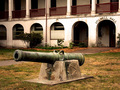
| 05/24/2008 04:48:58 PM | Really Shouldn't Trespassby BAMartinComment: *Critique Club*
Hi Barbara!! Russell here to answer your request for a little critique on your photo. I can share some of your vision here, the cannon has some great color and texture, a great subject overall, unfortunately I think a better angle would have worked alot better.
Anytime your subject is placed in the middle it needs to fill as much of the frame as possible giving the viewer the chance to "see" it too, with no major distractions. It truely BECOMES the subject (and this cannon could fit the bill with the color and texture).
If you want to include the background (the arches and lettering ARE pretty cool and gives an air of the "old days") maybe an angle that includes the front and part of the side of the cannon with the lettering and arches in the background and taken from just below the barrel so it gives foreground and background intrest.
Since I have not been to the Persidio since my days in the Marine Corps, I don't know if the rules have changed about getting close to the guns, if they haven't changed then get close, if they have, shoot portrait style from a low angle and use the telephoto.
After looking at your photo in PS CS2 I see that the arches are a bit "blown" hitting 255 on two channels (especially the red channel) kind of makes things a bit distracting. Watch your ISO and shutter speed, seems a bit high on the ISO for an outside shot.
You definately have an eye for photography, as seen by your portfolio (loved your "leading Lines" entry!!) if you get another shot at this cannon, or anything similar, take the time to shoot it from alot of different angles (hard to do when time is short - believe me I know) then check them when you have had some time to relax.
Russ | | Photographer found comment helpful. |
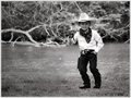
| 05/12/2008 05:33:07 AM | Quick Drawby karmatComment: *Critique Club*
Lets start by saying "Cute Shot"!! A very good candid photo of the young man, his family will be pleased for sure.
There are several really good things present in the photo, kids are always a popular subject and your model is no exception. The western get up (or costume) complete with six-shooter is a step beyond just a cute chid. His pose is also great (children seem to take forever to get the "right" shot sometimes). Lastly, the change to black and white was a great idea, gives the photo a different feel. There is some noise all through the shot, but since it is B&W it kind of gives the photo an overall grainy old time feel.
Unfrotunately, what probably hurt this photo the most was the background. The twisted mass of brush and fallen trees in the background are not blurred enough, and may not have been the best choice. The gun is kind of blending in to the background and if someone just glances at the shot, they may miss it. The river is kind of featureless, and even though B&W is popular, in this case it makes the river worse.
There is also the problem with the hat shading the eyes - unfortunately, since this was a candid shot, using a reflector to put some light on his face probably was not something that was thought of, but in the future you might try to include one in your kit, hats on kids (grown-ups too, sometimes) are fun, the shadows though are hard to work with.
Some things that might have made the photo score a bit better - move your position so the background is a bit less distracting, or zoom the lens in a bit closer (if no other background is available to you) and make it a frame filling shot (With a tele lens, zooming in will also blur more and remove alot of distraction)
On the bright side - your portfolio is full of great shots, you have a great eye and great skills, I see you achieving your photography goals easily.
Russ |
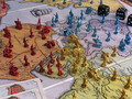
| 05/11/2008 02:46:47 PM | Life Imitating Lifeby klkitchensComment: *Critique Club*
Have to first say, it does bring back a memory or two!!
The lighting was very well done and the focus points are close to perfect (trying to bring the viewer into the scene).
The problem, for me lies in the amount of clutter and like colors that compete with the subject. Like the mountain (I had forgoten that they were snowcapped!!), green part of the board, green car, etc. then the spinner wheel kind of detracts from the subject.
The green car seems to blend into the board and the mountain making the image look really "full" and the white church combined with the insurance policy adds to the fullness.
Though I like the idea, it might have been a touch better trying it in portrait orientation and without the green car and the blue car crashed into the house (the rear of the car pointing to the place on the board and the peg people strewn about).
It is a very creative way to use a very recognized game in a great way (think how many chess boards there were in this challenge, its nice to see something different but recognizable).
Russ | | Photographer found comment helpful. |
| 05/11/2008 01:56:08 PM | Conquer the World (Risk)by bobnospumComment: *Critique Club*
I like the concept and the colors are good, it seems somewhat soft, it kind of makes the figures look like plastic. To improve on this shot think a human or two would have been good and possibly lit from the top more. Giving the impression that there was actually a game going on (possibly a hand moving on of the figures or dropping the dice).
I also think it might have been better overall had it been shot at a lower angle with the lighting on one side and casting a few shadows. Plus putting you a bit closer to the figures, there is the chance for more of the detail present in your set to be seen. Might require the use of a small box of some type (to set the camera on)to get that low and the delayed shutter to try and keep any movement to a minimum. Of course, you could also only use one or two lights (or lamps) so it makes it darker then bring in some dry ice for smoke. The possibilities are endless with a game like this, so I believe you are on the right track.
Russ | | Photographer found comment helpful. |
| 05/11/2008 09:19:15 AM | Light vs. Dark - An Epic Battle by fldaveComment: *Critique Club*
I really like the concept of this shot and the set-up is good. Unfortunately the execution is lacking somewhat.
While I like your shooting position(seems to be just the right distance from your foreground pieces), it might have been better centered between the dark king and queen and a bit more level, that way it keeps the viewer from feeling like they are "falling off" the right side.
The lighting on both sides of the board has resulted in blown highlights (on the right side it really hurts four chessmen). Perhaps raising the board by using clear glass jars or glasses - something to move the light farther away from the board. Might also use something to diffuse or soften the light (I use a couple sheets of wax paper)
The lighting on the right side also makes the board appear to have a large crack due to the glare.
The lighting on the clear pawns(from King to Queens Bishop) is great and I would think that raising the board and moving the lights would give that same effect on all of the clear pieces.
Good idea, just a little more work on the details
Russ | | Photographer found comment helpful. |
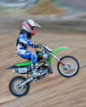
| 05/11/2008 08:40:04 AM | Quick ascentby ProwlerComment: *Critique Club*
A great panning shot, good action, subject and colors. The focus is a bit soft, but not truly distracting. The background is nicely done and shows motion.
Cropping is a bit tight which kind of forces the viewer to see that some of the uniform lettering and other areas are soft, though the bike is fairly sharp. A bit more of the track in front of the rider would also move the subject to the left of center a bit and give the viewer a sense of perspective(where the rider is going).
The main colors here are red, blue and green always a good combo - the problem is the red and blue look a bit washed out, not hot, but lacking a bit of normal contrast. I believe that this might be due to the shadow highlight function, it tends to wash out colors. Next time you use it make a hue and saturation layer and give the dominant colors in your shot a little boost(try the individual colors instead of the RGB setting - they can be found in the drop down box).
Something you might try next time - Use a bit faster shutter speed (in the 1/125 or higher) capture the bike and rider in sharp focus, use the shadow/highlight function if needed, then use the hue and saturation function on your dominant colors. If the background is not blurred to your liking - then add a duplicate layer use the blur filter then a layer mask to paint the rider back in. (Though this might not be "legal" for a challenge here as it does add a motion feature - it would make for an excellent photo!!)
Overall - it is a good sports panning shot, a difficult technique to master, but one you have done a good job with.
Russ | | Photographer found comment helpful. |
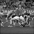
| 05/11/2008 06:52:22 AM | Ball Games: Enough To Make A Grown Man Cry!by hotpastaComment: *Critique Club*
This is a tough shot to critique as there is very little, if anything, wrong with it.
The black and white treatment is done well and the details, from the sweat in the black stripe of one uniform to the tatoo and muscle tone of other players, are all excellent.
I think you did a great job with the title, as it helps the viewer see what you want them to see. It took a good minute or two before I caught the events happening to the right. Seems like another story unfolding there. While twister would have included everyone in the shot, your title was powerful enough to keep the viewer focused on your primary subject, not always easy when taking shots of this type.
The expressions captured were also great, I especially like the one of the player coming up in the middle, it is almost like he is saying what every male viewer is thinking!!
Some things I noticed after looking long and hard, the railing banner is a bit askew - I noticed that in most of your outakes it is fairly level - does it hurt anything - no.
There is some noise in the background and the blur seems a bit much - but on the other hand, there are several "points" of light that actually work as a "frame" around your main subjects.
I might have liked it cropped in a bit on the left side (removing those two players), as is though it is good and only a minor distraction!!
Overall, after years of watching and playing American football (both organized and without pads) it makes me want to check this game out. | | Photographer found comment helpful. |
Home -
Challenges -
Community -
League -
Photos -
Cameras -
Lenses -
Learn -
Help -
Terms of Use -
Privacy -
Top ^
DPChallenge, and website content and design, Copyright © 2001-2025 Challenging Technologies, LLC.
All digital photo copyrights belong to the photographers and may not be used without permission.
Current Server Time: 04/18/2025 12:12:26 PM EDT.
|