| Image |
Comment |
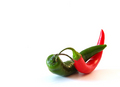
| 11/30/2007 03:45:50 AM |
Some Like It Hotby bubeltrubelComment: Thought about doing this myself but with some more in the fore/background with some DOF effects going on. This is nice and simple and the two colours are well balanced, well composed. The blueish looking shadow is a bit odd |
 Photographer found comment helpful. Photographer found comment helpful. |
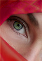
| 11/29/2007 03:59:42 AM |
Envyby MelissaRaeComment: The corner of the eye is sharp but the green of the iris is just relatively slightly off. If the focus has been on the centre of the eye this would have been great. Also, saturating the green a bit more and bringing out the catch light a bit more would have really made the eye sparkle and improve the overall image no end IMO |
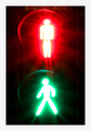
| 11/29/2007 03:57:45 AM |
Expecting Christmasby william88Comment: Great lighting, eyes nice and sharp which is vital, the green is not as strong as the red though and could do with a bit of a saturation boost to provide more colour balance. |
| Photographer found comment helpful. |
| 11/29/2007 03:56:47 AM |
Opposites Attractby pointandshootComment: Unusual entry, could have done with boosting the orange during post processing though so it is of the same "strength" as the blue. The blue takes up a lot more area and so if anything, the orange needs to be even stronger still to provide balance and so to achieve this you might have had to desaturate the blue channel as well as saturating the red. |
| Photographer found comment helpful. |
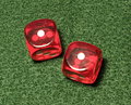
| 11/29/2007 03:54:26 AM |
Snake eyesby ahilgefortComment: Focus seems to be on the green surface and not on the dice and so the image as a whole seems out of focus as the dice are the "eyes" and therefore the main subject of the image. Using a smaller apature to ensure everything is sharp, or using manual focus to get the tops of the dice in focus would have been better IMO. |
| Photographer found comment helpful. |
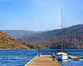
| 11/29/2007 03:52:08 AM |
serenityby charliebakerComment: Wouldn't have bothered putting on the border, you can only see it on two of the sides, perhaps a white border or a black border with a thin white line through it so you can clearly see it on all sides might have been more effective. Nice colours in the sky, but the majority of the image is silhouette and takes the focus away from the colours. Would have been better perhaps being mostly made up of sky (+ reflection) with the black landscape to add some interest and break it up a bit. |
| Photographer found comment helpful. |
| 11/29/2007 03:48:46 AM |
|
| Photographer found comment helpful. |
| 11/29/2007 03:47:58 AM |
Deside yourselfby floipComment: Really good glow effects. Could be a touch sharper and would have been more effective if the rims of the lights were not visible. Very wide border, whats that all about |
| 11/28/2007 03:49:40 AM |
|
| Photographer found comment helpful. |
| 11/28/2007 03:48:27 AM |
At The Mall?by scarbrdComment: Just off being completely symmetrical unfortunately. Would have been great to have it either spot on or more deliberately from an angle. This is somewhere inbetween and isn't working for me. |
| Photographer found comment helpful. |
Home -
Challenges -
Community -
League -
Photos -
Cameras -
Lenses -
Learn -
Help -
Terms of Use -
Privacy -
Top ^
DPChallenge, and website content and design, Copyright © 2001-2025 Challenging Technologies, LLC.
All digital photo copyrights belong to the photographers and may not be used without permission.
Current Server Time: 04/18/2025 08:28:03 PM EDT.