| Image |
Comment |
| 12/19/2007 03:41:00 AM |
S n o w ! ! !by JovanComment: Buying on ebay is perhaps a little far fetched, but its nice not to vote on another still life. The foot tracks in the otherwise burn out snow almost has a glow and is very well composed although could have pushed the tones a the lower end for a bit more constrast. The fence works well to break up the snow from the background and again is well composed |
 Photographer found comment helpful. Photographer found comment helpful. |
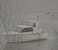
| 12/18/2007 03:59:48 AM |
maybe it was only a bad dreamby tnunComment: Very dull tone wise, could have done with a visit to the Levels or Curves tool to boost the tonal range, especially as this is bordering on a B&W and so extreme contrast is everything. The trees in the foreground obscure the boat, the birds are a distraction and for composition, could have done with placing the boat more to the right as it is facing towards to left and so creating empty space on the left for the boat to "move" into would have given you much better balance. |
| Photographer found comment helpful. |
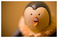
| 12/18/2007 03:56:11 AM |
RARE - Handpainted Penguin figurine! BIN!by shamerComment: Complicated title. The colour of the background is quite similar to the hue of the main subject and given you have a crazy amount of DOF going on, the two blend together and the whole image appears to have a yellow/orange cast. Perhaps a more neutral or complementary colour for the background would have isolated the penguin more effectively. |
| Photographer found comment helpful. |
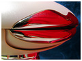
| 12/18/2007 03:53:05 AM |
Antique Christmas Ballsby freakin_hilariousComment: Uncomplicated abstract image. Strong colours, nice and sharp in the focal area and good bokeh in the background. Well composed, the sharp area is roughly a third in from the right. The colour of the background is the only thing that bugs me and is a little distracting. Perhaps a more neutral hue might have worked better |
| Photographer found comment helpful. |
| 12/18/2007 03:50:26 AM |
Woot!by Yo_SpiffComment: Can't really tell what this is and the title is not helping me. |
| Photographer found comment helpful. |
| 12/18/2007 03:49:41 AM |
|
| Photographer found comment helpful. |
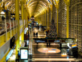
| 12/17/2007 04:00:32 AM |
Miniature Station - With Lights!by levyj413Comment: Massive DOF going on - its almost too much though. The upper floor on the left hand side is a bit distracting as it is in focus but distracts the eye away from the three people and the tree which is the main area of interest. Perhaps would have been more effective to crop out the left hand side altogther leaving you with a more portrait aspect ratio to complement the the high ceiling and the feeling of the people being small - even in a miniature station. |
| Photographer found comment helpful. |
| 12/17/2007 03:56:12 AM |
She bought me on ebay, if only I knew being her husband would require the wifely duties : (by bennettjamieComment: Interesting concept, long winded title though. The whole thing could do with being sharper, although if just the face was in focus then all would be well. Composition wise, the subject is placed in the centre of the frame and could be a lot more interesting if placed say a third from the left. On the background, there is a shadow (bottom right) and a specular highlight (mid right) both of which are very distracting. |
| Photographer found comment helpful. |
| 12/17/2007 03:52:13 AM |
Coke is it !!by andrewtComment: Nice illusion - had to look at it for a while. Still trying to work out the concept, so ... the item from ebay is two coke bottles, but whats with the water? the freeze-frame water drop? the water drop on the right hand side? the two different coke logos? the purple background? one of them upside down?What does it all mean??? |
| Photographer found comment helpful. |
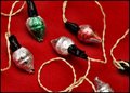
| 12/17/2007 03:48:44 AM |
Cheap Christmas Lights (ALWAYS read the decription!)by karmatComment: Lighting seems a little harsh. The red background is quite dominating and takes the focus off the lights. The composition is not great either I'm afraid - three of the lights intersect the border. Might have been more effective to have a much lower down viewpoint and have more of a DOF effect going on and having just one of the lights in focus, that would have given you a clear focal point and taken the emphasis off the red surface. |
| Photographer found comment helpful. |
Home -
Challenges -
Community -
League -
Photos -
Cameras -
Lenses -
Learn -
Help -
Terms of Use -
Privacy -
Top ^
DPChallenge, and website content and design, Copyright © 2001-2025 Challenging Technologies, LLC.
All digital photo copyrights belong to the photographers and may not be used without permission.
Current Server Time: 04/15/2025 10:54:45 PM EDT.