| Image |
Comment |
| 01/04/2008 04:03:51 AM |
Fire in the Skyby PoobaComment: Composition is a bit strange, the thin band of what appears to be ground at the bottom might have been better if it was a third up from the bottom of the frame. Also could have done with a ccw rotation to square up the horizon. Lovely colours though |
 Photographer found comment helpful. Photographer found comment helpful. |
| 01/04/2008 03:58:53 AM |
|
| 01/04/2008 03:58:11 AM |
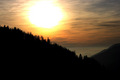
Mountains Aflameby PsychonauticalComment: Well composed. The tree line could be a little sharper but this might just be because of the resize. Perhaps increasing the purple saturation in the sky to complement the yellow hues might have been worth considering |
| 01/04/2008 03:56:18 AM |
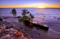
Fire In The Skyby JudiComment: Lovely complementary colours going on. Well composed (position of the sun a third in from the right) but could have done with moving the horizon down a touch to follow suit. Good foreground detail but might have been worth taking the shot from ground level to increase the effect. |
| Photographer found comment helpful. |
| 01/04/2008 03:54:14 AM |
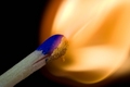
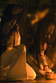
Incendie jongleurby VenomComment: Let down by the background and clothing, both of which take the eye away from the flames. For instance, plain black clothes would have said to me "the choice of clothing has been considered and was a deliberate attempt at keeping the shot simple" whereas this is saying "its what the model happened to have on at the time" and doesn't complement the image or concept |
| Photographer found comment helpful. |
| 01/04/2008 03:50:52 AM |
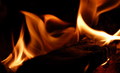
Fire Flowersby LadyKComment: Just lacking a sharp focal point for me. Interesting patterns but is let down by the composition. Perhaps a much tighter crop around the sharpest area would have created a bold abstract. |
| Photographer found comment helpful. |
| 01/04/2008 03:49:12 AM |
Lonelinessby zvonoComment: Just lacking a sharp focal point to offset the blurryness of the flames. |
| 01/04/2008 03:48:38 AM |
Spirits of Fireby Phoenix-5Comment: The distracting glow near the top right hand corner is ... well... distracting. If only it wasn't there as the rest of the image is quite different from a lot of other entries and is very well composed and has nice DOF. The fire element is subtle and with the colour cast complements the other subjects. |
| 01/04/2008 03:46:19 AM |
Blue Hotby dwainasaurusComment: Nice to see something shape in an image to complement the blurryness of the fire element - so many other entries are just low lit blurred efforts. There is quite a strong yellow colour cast on the entire image other than the flame itself which is actually quite effective. |
| Photographer found comment helpful. |
| 01/03/2008 04:00:16 AM |
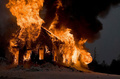
Raging Inferno by L2Comment: Very dramatic and I'm guessing not staged, which must be the first I've voted on in this challenge so thats nice to see. Could perhaps have pushed the constrast higher still with levels or curves to deepen the blacks as there is hardly any detail there anyway on my display and a building silhouette would have been stunning. The tree in the background is a shame. |
| Photographer found comment helpful. |
Home -
Challenges -
Community -
League -
Photos -
Cameras -
Lenses -
Learn -
Help -
Terms of Use -
Privacy -
Top ^
DPChallenge, and website content and design, Copyright © 2001-2025 Challenging Technologies, LLC.
All digital photo copyrights belong to the photographers and may not be used without permission.
Current Server Time: 04/13/2025 06:36:06 PM EDT.