| Image |
Comment |
| 01/16/2008 03:53:18 AM |
Bananasby jere2201Comment: Reflection on the wall and flash casted shadow let this down technically. Artistically, the horizonal line on the wall, the light source on the floor and the strange banana stand all add unnessesary complications. The subject is the bananas, a simple neutral background with a clever light source would have shown them off best IMO. |
 Photographer found comment helpful. Photographer found comment helpful. |
| 01/15/2008 10:57:24 AM |
Sourpuss by loveComment: Lovely B&W, I reckon this will make the top ten, well composed, good sharp eyes and excellent levels |
| Photographer found comment helpful. |
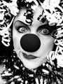
| 01/15/2008 04:00:47 AM |
Kikiby JeniYComment: Very vibrantly coloured as you might expect for a clown subject and comes across as quite a typical "portfolio" image that a clown my use in a circus programme, business card or pinned up on the notice board in the reception of an entertainment holiday camp. I worry that to score highly here, you need to sometimes do the unexpected and go against the grain. But well exectued none the less |
| Photographer found comment helpful. |
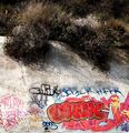
| 01/15/2008 03:57:26 AM |
Clown Head by Ewigby pointandshootComment: Not really seeing the connection to the challenge unfortunately. The thin white strip at the very bottom should have been cropped off IMO. What have the trees got to the do with it. A much tighter crop on just the graffiti might have been worth considering |
| Photographer found comment helpful. |
| 01/15/2008 03:55:52 AM |
Ridi pagliaccioby Rino63Comment: Red colouring on the neck is a little strange. Well composed though, the focus is slighly off on the eyelid compared to the cheak but as the eye is closed its not so noticable. |
| Photographer found comment helpful. |
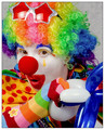
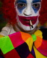
| 01/15/2008 03:54:28 AM |
Pagliaccioby rinacComment: Uncomplicated background, nice and sharp with vibrant colours. Well composed. Not a lot to fault on to be honest. |
| Photographer found comment helpful. |
| 01/15/2008 03:53:30 AM |
sigh... I wish he'd stop clowning around...by rdebruynComment: Noisy reflections, blue fringing and not particularly sharp let this down technically. Artistically this is well composed although only connected to the brief through the title and so is a little weak in that respect |
| Photographer found comment helpful. |
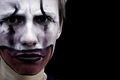
| 01/14/2008 04:02:46 AM |
Backstage at the Apolloby QuasimojoComment: Whites of the eyes are quite dull, but under basic editing theres not a lot that can be done there. Not totally convinced the focus is fully on the eyes. The brightness of the bowtie is not matched but the colouring of the makeup and hair and so takes the focus away from the face |
| Photographer found comment helpful. |
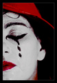
| 01/14/2008 03:54:57 AM |
sadness in disguiseby guakoComment: Nice expression and title. Well composed, good focus on the eyes. Quite a dreary colour scheme and not vibrant at all like you might expect for a clown entry and it really reinforces your concept here. Well done. |
| Photographer found comment helpful. |
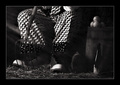
| 01/14/2008 03:53:30 AM |
Swing Shiftby mpetersComment: Lovely B&W conversion, very different to the others which are all very vibrant as you would expect for clowns and so this makes for a welcome change. The B&W really adds to the title and "retired clown" theme with the fork etc.. Nice not to see the face as well actually, just the trousers and shoes are enough and is quite subtle. My only problem is the border, why so wide |
| Photographer found comment helpful. |
Home -
Challenges -
Community -
League -
Photos -
Cameras -
Lenses -
Learn -
Help -
Terms of Use -
Privacy -
Top ^
DPChallenge, and website content and design, Copyright © 2001-2025 Challenging Technologies, LLC.
All digital photo copyrights belong to the photographers and may not be used without permission.
Current Server Time: 04/12/2025 09:39:37 PM EDT.