| Image |
Comment |
| 01/18/2008 03:49:20 AM |
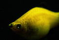
DPC'r sees YELLOW!by Prof_FateComment: Obviously, the yellow item should be the main subject but is out of focus. Interesting idea though |
| 01/17/2008 04:00:25 AM |
Subconsciousby freakin_hilariousComment: Normally I would say that noise in this quantity is pretty undesirable and I am still close to continuing to agree with that, but this is almost pushed so far that it is almost a positive thing and adds to the image. I am sure there will be plenty of voters that disagree though. Well composed |
 Photographer found comment helpful. Photographer found comment helpful. |
| 01/17/2008 03:58:11 AM |
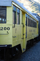
"All Aboard"by quicksnapsComment: Could have pushed the saturation of the yellow harder during postprocessing to really reinforce the image. Seems to have a bit of a blue cast, might have been worth setting the white balance manually off the top of the train (given its the subject) rather than the background. |
| Photographer found comment helpful. |
| 01/17/2008 03:55:54 AM |
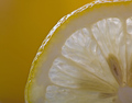
Slice of Sunshineby izadoodleComment: The background is filled with a more saturated yellow than the lemon. Given the lemon is the subject (combined with the yellow brief) I believe that it should be round the other way - stronger yellow on the lemon against a black background to maximise contrast. Pushing the levels at the top end to beef up the whites in the lemon flesh would have been another modification worth considering. Well composed although not particularly original concept |
| Photographer found comment helpful. |
| 01/17/2008 03:52:39 AM |
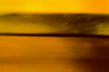
Sand and Sunby jaysonmcComment: The yellow colouring is there alright, but it just far too blurred and has no real focal point |
| Photographer found comment helpful. |
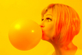
| 01/17/2008 03:50:42 AM |
*POP*by PuckzzzComment: Almost too yellow, I'm wondering if a completely black background would have been more effective to create maximum contrast with the balloon |
| Photographer found comment helpful. |
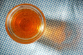
| 01/16/2008 04:01:59 AM |
Honeyby titusbartosComment: On my display this is bordering on the orange more so than yellow. Could easily have shifted the hue during post-processing and also done a desaturation of the blue tones in the surface giving a nice golden yellow honey against a mono environment for maximum impact |
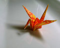
| 01/16/2008 03:59:54 AM |
Craneby JetComment: On my display, this seems to be verging on the side of orange rather than yellow I'm afraid. A relatively low difficulty factor compared to some of the others which will prevent this scoring in the top 50% |
| Photographer found comment helpful. |
| 01/16/2008 03:58:25 AM |
Golden Eyesby chickadeezlComment: The red and blue hues seem more highly saturated on my display than the yellow of the eyes. Given the brief is "Yellow", it should be the other way round. A tighter crop on just the eyes would have achieved this and elminated the distracting background (complete with flash shadow) |
| Photographer found comment helpful. |
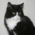
| 01/16/2008 03:56:44 AM |
Cat Eyeby cordeliawlComment: I find the use of flash to nearly always let down an image. Here you have a shadow on the wall which isn't great. Whats with the vertical strips on the wall? - a more neutral background would have been preferable. Perhaps a tight crop on just the face, eliminating the background issue altogether and ensuring perfect focus on the eyes with some DOF going on I'm sure would score higher |
Home -
Challenges -
Community -
League -
Photos -
Cameras -
Lenses -
Learn -
Help -
Terms of Use -
Privacy -
Top ^
DPChallenge, and website content and design, Copyright © 2001-2025 Challenging Technologies, LLC.
All digital photo copyrights belong to the photographers and may not be used without permission.
Current Server Time: 04/12/2025 03:20:58 PM EDT.