| Image |
Comment |
| 01/22/2008 03:39:16 AM |
dishwasherby k4ffyComment: This just seems very flat somehow - the pure black and white corners do nothing to add interest. Perhaps a lower viewpoint, macro, much wider angle and larger apature to get some perspective distortion and DOF to vary the texture and add interest. |
 Photographer found comment helpful. Photographer found comment helpful. |
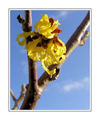
| 01/22/2008 03:37:25 AM |
Witch Hazelby ggroothuisComment: FAT border - whats going on there, hardly any room left for the imagel which, by the way, is pretty good, lovely lighting, DOF and vibrant colours |
| Photographer found comment helpful. |
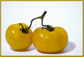
| 01/22/2008 03:36:27 AM |
Immature Tomatoes by LouisaComment: Yellow hue could have done with a bit of a saturation boost to make it more vibrant. Whats with the purple shadows and and the purple halos around the outsides of the tomatoes. Well composed although spoilt a bit for me by the overstylised border |
| Photographer found comment helpful. |
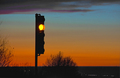
| 01/21/2008 03:59:30 AM |
it's almost your turnby desertoddityComment: A lighter portrait aspect ratio crop on the traffic light against just the sky would have been simpler and more effective. The horizon and trees are really just unnessesary and don't help to reinforce the concept of the entry |
| Photographer found comment helpful. |
| 01/21/2008 03:57:50 AM |
Shadow Danceby hihosilverComment: Its not screaming yellow at me, but yellow it is and is very interesting none the less. Quite a difficult shot to get. I am sure there will be far inferior bird entries next week in the other challenge. |
| Photographer found comment helpful. |
| 01/21/2008 03:56:28 AM |
crackedby Wenders11Comment: Nice and simple, superb lighting and interesting concept. Good entry |
| Photographer found comment helpful. |
| 01/21/2008 03:55:53 AM |
Splash!by PGerstComment: Nice complementary colours working well together, good job on the freeze frame, its hard to setup and difficult to control so well done on that front. The viewpoint is the only thing letting this down for me, much closer to the water and more wide angle would have been more dramatic and would have added extra interest. |
| Photographer found comment helpful. |
| 01/21/2008 03:53:59 AM |
Take-off!by jodis_evaComment: Amazing colours and lighting. A non textured surface would perhaps have been a simpler choice - a smoked mirror for example taken off the wall and layed down flat would have been ideal |
| Photographer found comment helpful. |
| 01/21/2008 03:52:11 AM |
The Ruby Girlby louinsdComment: This just seems to be fairly blurred to me. If just the eyes were sharper then the image would be saved. |
| Photographer found comment helpful. |
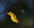
| 01/21/2008 03:51:13 AM |
Resplendentby JutildaComment: Not sure if I like the border but its certainly different and given me something to think about so thats all good stuff. Good sharpness on the leaf against a non-distracting, but still quite interesting background. |
| Photographer found comment helpful. |
Home -
Challenges -
Community -
League -
Photos -
Cameras -
Lenses -
Learn -
Help -
Terms of Use -
Privacy -
Top ^
DPChallenge, and website content and design, Copyright © 2001-2025 Challenging Technologies, LLC.
All digital photo copyrights belong to the photographers and may not be used without permission.
Current Server Time: 04/12/2025 11:00:33 AM EDT.