| Image |
Comment |
| 05/08/2010 11:22:31 PM |
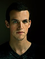
Forever Youngby SenayComment: nice self portrait, man those are so difficult! this one is good, i just have a few suggestions that I think I would have done differently. The eyes look a TAD bit over processed, it looks like over saturation or too much burning or something around the colored part of the eye.I might have also been hesitant at shooting in portrait orientation, because I think off centered landscape orientation self portraits give more of an impact visually, sometimes i think I get bored with portraits in portrait orientation, but obviously everyone has different opinions! By the way DOF is great, I like that you kept the skin looking natural. All around great self portrait... |
 Photographer found comment helpful. Photographer found comment helpful. |
| 04/08/2010 10:39:51 PM |
|
| Photographer found comment helpful. |
| 04/02/2010 03:11:33 PM |
|
| 03/09/2010 05:31:35 PM |
|
| 03/09/2010 05:30:13 PM |
|
| Photographer found comment helpful. |
| 03/09/2010 05:29:51 PM |
|
| Photographer found comment helpful. |
| 02/23/2010 08:30:26 PM |
The Break by donjamesComment: thank you for submitting an image worth voting on, most of these pictures are terrible! you get a 10!! |
| Photographer found comment helpful. |
| 02/23/2010 08:29:33 PM |
|
| Photographer found comment helpful. |
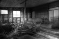
| 02/15/2010 07:35:31 PM |
oldie but goodieby phooztComment: Hello! You have requested a comment from the critique club:
First Impression/Opinion: there seems to be a lot to take in here all at once, my eyes aren't really sure where to look first! this could have been improved by totally avoiding the clutter in the lower left hand corner & taking the shot of the main chair/couch from a different angle. i love the texture you captured on the back wall and ceiling...FANTASTIC! I would have liked to see this in color as well, the black and white feels a little bland to me...
Composition: i'm not a fan of the main subject in the direct center of an image, like i said above, you could have taken this from a different angle to give it some more interest without the clutter in the lower corner...
Post Processing: personally i would have liked this sharper and in color.
Challenge Criteria: as commenters stated below, is a couch a chair? hmm i don't know if it completely fits the challenge. I did not vote, but would have given a 5.
good luck on your future challenges!
|
| Photographer found comment helpful. |
| 01/10/2010 09:54:11 AM |
|
Home -
Challenges -
Community -
League -
Photos -
Cameras -
Lenses -
Learn -
Help -
Terms of Use -
Privacy -
Top ^
DPChallenge, and website content and design, Copyright © 2001-2025 Challenging Technologies, LLC.
All digital photo copyrights belong to the photographers and may not be used without permission.
Current Server Time: 04/07/2025 06:23:50 AM EDT.