| Image |
Comment |
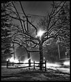
| 02/09/2010 05:14:56 AM |
Bitter Windsby KelliComment: Hi! Love the photo - it gives me a very warm feeling initially, and while I can't figure out how I feel about the focus, I think there's a lot contributing to a slightly blurred effect, like the snow resting on the branches, the falling snow breaking up the straight lines of the branches etc, and - I'm assuming - the Bitter Winds themselves! Good luck! |
 Photographer found comment helpful. Photographer found comment helpful. |
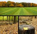
| 10/24/2009 12:34:30 AM |
Finding Fallby ti_evomComment: Generally nice, but i would have put the larger frame at the bottom, makes it easier for the viewer. In fact, i would have changed it to keep the colour scheme in line because the green in the top frame is quite strong. Having said that, i really like the bottom two pictures. Nice perspective... |
| Photographer found comment helpful. |
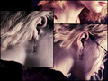
| 10/24/2009 12:20:22 AM |
Eleganceby HaneckComment: I like the idea and the composition, but I think the colour casts make the entry look too faded. |
| Photographer found comment helpful. |
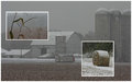
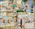
| 10/23/2009 11:41:03 PM |
crop dustingby skewsmeComment: I really really like the idea - I just wish the focus on the main panel was tighter on the silos (or is it an unavoidable function of the crop dust, making it look noisy?). Then again, my girlfriend prefers it the way it is, so of course I now think that I do too ;-) |
| Photographer found comment helpful. |
| 10/23/2009 11:39:15 PM |
The fancierby HighNoonerComment: Good story, but I think the borders on the two lower panels should have been thicker, in order to separate them from the similar colours of the main panel. |
| Photographer found comment helpful. |
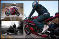
| 10/23/2009 11:35:03 PM |
A Ride Before Fallby RodertComment: Nice innovation of the triptych - and a sweet bike, of course! I'd like to have seen both the internal panels b&w - just to see which way works best. Good luck! |
| Photographer found comment helpful. |
| 10/23/2009 11:34:47 PM |
A Day In The Sunby ReM_FrComment: Great idea, and well executed. Just sad that the left panel can't be brightened up a little to compete with the middle panel. Good luck! |
| Photographer found comment helpful. |
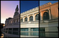
| 10/23/2009 11:34:19 PM |
1+1=3!by HarveyGComment: Awesome! I like the humour very much - cheers! Shame about the reflections off the "top" pair of feet in the second frame, but the action blur is nicely suggestive! Expect 9s-10s from the foot-fetish crowd ;-) |
| Photographer found comment helpful. |
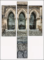
| 10/23/2009 11:33:59 PM |
Transept Narthexby dougi555Comment: Sweet use of the triptych mandate - I like the idea. I don't know if it could be more balanced (in terms of the lines of the steps and lintel), or if that would've looked worse? Good luck! |
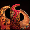
| 10/23/2009 11:31:21 PM |
Gourd Artby dahvedComment: Very beautifully done, from the composition to the focus. I think the red's a little bright on the middle panel, but the important thing is that the terracotta matches across all three. Good luck! |
| Photographer found comment helpful. |
Home -
Challenges -
Community -
League -
Photos -
Cameras -
Lenses -
Learn -
Help -
Terms of Use -
Privacy -
Top ^
DPChallenge, and website content and design, Copyright © 2001-2025 Challenging Technologies, LLC.
All digital photo copyrights belong to the photographers and may not be used without permission.
Current Server Time: 04/07/2025 06:12:01 AM EDT.