| Image |
Comment |
| 05/29/2007 03:03:24 PM |
beeby KronusComment: This is a great photo with beautiful colors the only thing to mention is that you could have used a slightly higher aperture as you could have gotten a sharper image which would have made the bee stand out more as it wouldn't be blurry on the left side and on the tip of the wing... I know this is a difficult capture with little time for settings but everybody gets better by trying.
But You probably already knew this.
Hope anyhow my comment is helpful. |
 Photographer found comment helpful. Photographer found comment helpful. |
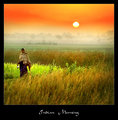
| 05/23/2007 11:54:44 PM |
Indian Morningby gaurawaComment: I Love the foto just wish it was taken at a little higher shutter so the woman was a little sharper. |
| Photographer found comment helpful. |
| 05/21/2007 04:33:03 PM |
|
| Photographer found comment helpful. |
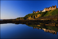
| 05/21/2007 04:31:47 PM |
Morning Calmby inshaalaComment: Classic postcard :D Just to give a little critique i would have cropped 2 mm more from the left to remove the tiny little yellow spot at the house. But that's just me being picky... |
| Photographer found comment helpful. |
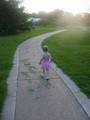
| 05/21/2007 04:28:59 PM |
Walking Awayby tUpAc_LiL_bRoThAComment: The child in the foreground seems blurry. Try using a higher shutterspeed when taking these photos even in low light you can force it using manual setting. |
| Photographer found comment helpful. |
| 05/21/2007 04:26:36 PM |
After the Rainby SDWComment: This is a great image if it wasn't for the blurry person. I like the serpia on this picture very classic. However try forcing a faster shutterspeed even with the high aperture used here, you would have gotten a sharp image of the person though the image might have been a little darker but for that there is photoshop. |
| Photographer found comment helpful. |
| 05/21/2007 04:22:43 PM |
Whirlingby fainaComment: Seems a little too artificial with only the grass annd trees being saturated. I think you could have pulled it off as it is otherwise a nice image if you had made the sky colored as well. |
| Photographer found comment helpful. |
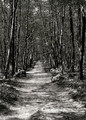
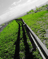
| 05/21/2007 04:19:36 PM |
Vanishing Pathby adeldeganComment: In this image which I like i would have used a little more contrast. Try it if you like and tell me what you think. |
| Photographer found comment helpful. |
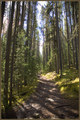
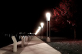
| 05/21/2007 04:18:26 PM |
The Pathby stphwComment: In the attempt with the long exposure im not sure these light are very usefull as they are simply too bright and create a lot of noise and blurry/fuzzy features. |
| Photographer found comment helpful. |
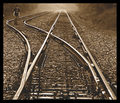
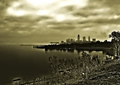
| 05/21/2007 04:14:47 PM |
urbaniaby tateComment: Everything seems to dissapear in this image... |
Home -
Challenges -
Community -
League -
Photos -
Cameras -
Lenses -
Learn -
Help -
Terms of Use -
Privacy -
Top ^
DPChallenge, and website content and design, Copyright © 2001-2025 Challenging Technologies, LLC.
All digital photo copyrights belong to the photographers and may not be used without permission.
Current Server Time: 04/07/2025 06:23:49 AM EDT.