| Image |
Comment |
| 04/24/2005 05:28:13 AM |
Single people in the fieldby NunoComment: I like this very simple setup. To improve it I think I would have tried moving the subject down the hill to the left so that she was in the first third of the shot and sky was the only background behind her. She would have stood out more. Also this is a fairly soft shot, maybe a little bit more focus on the face would have made her pop. |
 Photographer found comment helpful. Photographer found comment helpful. |
| 04/24/2005 05:24:47 AM |
Hypnoticby duncesComment: The top half of this picture I really like, the bottom no so much. The angle that you chose makes the head seem massive in comparison to the body and it almost looks carton like. Probably not the effect you were going for. The body also seems very soft, which further separates it from the head. I think perhaps flipping her on her side a little and shooting from the side would have helped the size proportions while maintaining your focus on the head. You also might try rotating the shot, as seeing someone lying down but in the vertical position is a little disconcerting. (However everyone does bed shots that way, so marks for creativity) |
| Photographer found comment helpful. |
| 04/24/2005 05:18:35 AM |
|
| Photographer found comment helpful. |
| 03/22/2005 02:48:49 AM |
The gameby GabrielComment: Very nice clean image. No curves/lines at all in the background, exellent job there. I imagine this was a pretty tricky subject in regards to lighting. A few blown areas, but nothing that is overly distracting or takes anything away from the image. |
| Photographer found comment helpful. |
| 03/22/2005 02:46:00 AM |
Temple Gardenby MAKComment: Very nice image. Excellent angle and I like how you composed it so that the roof fits to each of the images edges. The only thing I find slightly distracting is the tree (not like you can help that) and the sky looks a little light in comparision to the rest of the image. Again not something you can really fix unless you take a picture on a stormy day or at sunrise/sunset. |
| Photographer found comment helpful. |
| 03/22/2005 02:42:03 AM |
Oppositesby jbsmithanaComment: Well my first reaction is to laugh, as I suspect most people will. But once you get past the chuckles, this is such a fantastic. Your DOF is amazing, focus dead on; even the colours are vivid and add to the overall appeal of the image. I only wish I could take a picture like this. I usually try to leave some constructive criticism on each photo but frankly there is nothing you can improve here and this image is so far out of my league I think you need to leave me a comment to help me improve. =) |
| Photographer found comment helpful. |
| 03/21/2005 06:22:07 PM |
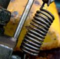
Mechanicaby AndrewTOComment: I think the lighting is pretty good in this picture. I can't even begin to guess what this is and maybe that�s what makes me look at this in an abstract way. It just doesn�t seem to grab me as an image and perhaps it�s my own lack of understanding of what I am looking at. My eyes are running all over the place without a point of focus. |
| Photographer found comment helpful. |
| 03/21/2005 06:18:57 PM |
The spiralby lastefComment: Great DOF, the yellow background really adds to the overall effect. As much as I try to leave constructive comments, i really can't think of what i would change about this. |
| Photographer found comment helpful. |
| 03/21/2005 06:17:31 PM |
Coffeeby sahkoComment: Nicely done. The focus and lighting is great. I wonder though if you tried this shot with the pot/kettle out of frame? I think the liquid and the mug could have carried the picture and it would have left you with some nice negative space at the top. Hard to say though without seeing it. |
| Photographer found comment helpful. |
| 03/21/2005 06:15:08 PM |
Bottoms Up: Spring Breakby khrysComment: Very nice, certainly looks a lot warmed then where I am right now. I like the angle, while becoming more popular these days this type of shot looks great when done well. (As it is here) The only thing that I would have looked at improving is the blown highlights at the top..but I imagine it was pretty hard in the bright sun to avoid those. |
| Photographer found comment helpful. |
Home -
Challenges -
Community -
League -
Photos -
Cameras -
Lenses -
Learn -
Help -
Terms of Use -
Privacy -
Top ^
DPChallenge, and website content and design, Copyright © 2001-2025 Challenging Technologies, LLC.
All digital photo copyrights belong to the photographers and may not be used without permission.
Current Server Time: 04/09/2025 12:52:47 PM EDT.