| Image |
Comment |
| 05/29/2007 09:37:20 PM |
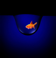
Divine Originby blade122Comment: I like the glow at the top. The tones and vignette also give it an old look and feel. |
 Photographer found comment helpful. Photographer found comment helpful. |
| 05/28/2007 01:31:06 PM |
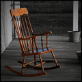
An Old Friendby JamesKWComment: The photo itself is good. But I think its surroundings are not interesting. Some contrast in the background may have helped but not much because the background is devoid of anything for use to look at after the rocking chair has captured our interest. A rocking chair make us think of relaxing, comfort, cosy, but nothing else supports these or at least the need for these. |
| Photographer found comment helpful. |
| 05/28/2007 02:07:50 AM |
|
| Photographer found comment helpful. |
| 05/24/2007 02:56:29 PM |
|
| Photographer found comment helpful. |
| 05/24/2007 02:51:52 PM |
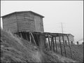
old stageby scwalshComment: I like the composition of this photo. The balck and white looks good but I think that the overexposed top right hand corner is a little distracting. Great job. |
| Photographer found comment helpful. |
| 05/23/2007 07:59:32 PM |
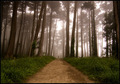
Morning Sentinels by mpetersComment: Great photo but I personally like the other one better. I think it is because the path curves a bit and I also like the colour tones better. I love the mist and they are both great photos. |
| Photographer found comment helpful. |
| 05/23/2007 03:07:11 AM |
A Brick in the Wallby BakerBugComment: I find the very narrow DOF distracting. No WOW factor as there is not really anything interesting about it for me. |
| Photographer found comment helpful. |
| 05/23/2007 03:05:58 AM |
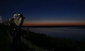
Sunrise over Chatham Harborby whiterookComment: Very grainy and I am finding it hard to see what is desaturated as the left side of the photo is as I would expect to see it when the sun is set. |
| Photographer found comment helpful. |
| 05/23/2007 03:05:41 AM |
Night Birdby CEJComment: Dont really like the subject,took me a while to realise it was a photo of a mural. It doesn't really show 'desaturation' very well to me. |
| Photographer found comment helpful. |
| 05/22/2007 08:42:47 PM |
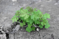
Rebirthby pmichaudComment: Would have been better for me if there was a little more contrast in the grey areas and if the green was a little greener. |
| Photographer found comment helpful. |
Home -
Challenges -
Community -
League -
Photos -
Cameras -
Lenses -
Learn -
Help -
Terms of Use -
Privacy -
Top ^
DPChallenge, and website content and design, Copyright © 2001-2025 Challenging Technologies, LLC.
All digital photo copyrights belong to the photographers and may not be used without permission.
Current Server Time: 04/13/2025 11:48:30 AM EDT.