| Image |
Comment |
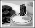
| 02/02/2004 01:39:15 AM |
Milk and Cookiesby RHoldenSrComment: Excellent trick, and the composition is very good as well. The border isn't really my taste, but I'm giving you a 9 anyway |
 Photographer found comment helpful. Photographer found comment helpful. |
| 01/29/2004 12:57:48 PM |
James Bond's Assassinationby labudsComment: Very clever, and looks like an '80s Martini ad. I love the composition (how the corner balances with the olive is particularly good), the colors are great, and it is just plain excellent all-round. The more I look the more I like |
| Photographer found comment helpful. |
| 01/29/2004 12:07:43 PM |
Fantasia by GordonComment: The best execution of the brush idea I've seen so far. Excellent |
| Photographer found comment helpful. |
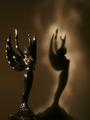
| 01/29/2004 12:00:07 PM |
Heaven & Hellby dsa157Comment: I like the shadow, but not the statue, and all the twinkling is an overkill IMO |
| Photographer found comment helpful. |
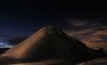
| 01/29/2004 11:56:59 AM |
|
| Photographer found comment helpful. |
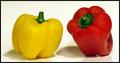
| 01/29/2004 11:46:04 AM |
Differentby ChiquiComment: Maybe I'm just daft, but I fail to see how it relates to the subject, even if the lighting source was handheld |
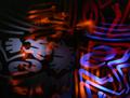
| 01/29/2004 11:42:03 AM |
|
| Photographer found comment helpful. |
| 05/09/2003 03:46:37 AM |
create. submit.by helgihelgiComment: I cut the camera out of an old magazine ad and crumpled it a bit, then shot it against a white backdrop. I bumped up the brightness and contrast in Photoshop to get the white I wanted, and to burn out the top/left edges.
But I think this would've worked much better with a crumpled image of a yellow flower against a blue sky for example. Something a bit more lively than the camera ad.
Thanks for the comments people :) |
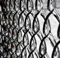
| 04/20/2003 07:37:14 PM |
Locked in Iceby BigSmilesComment: The red/brown color showing through on the left is distracting - it'd definetly be better in black&white. |
| Photographer found comment helpful. |
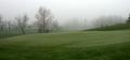
| 04/15/2003 12:02:57 PM |
Winter rules todayby drydocComment: I like the smooth flow of lines, soft colors, and ofcourse the 'trees in the mist' thing. I would've done two things differently: 1. cropped out the dark tree in the right end of the frame, and 2. more sky, less ground. Cropping about half of the dark grass at the bottom and including just a little bit more sky for contrast. |
| Photographer found comment helpful. |
Home -
Challenges -
Community -
League -
Photos -
Cameras -
Lenses -
Learn -
Help -
Terms of Use -
Privacy -
Top ^
DPChallenge, and website content and design, Copyright © 2001-2025 Challenging Technologies, LLC.
All digital photo copyrights belong to the photographers and may not be used without permission.
Current Server Time: 04/09/2025 12:46:35 PM EDT.