| Image |
Comment |
| 05/23/2003 01:29:48 AM |
sweet & sourby Pep VentosaComment: You did a very good job on the composition of this image. The apples are placed very well, wich results in a nicely balanced image. It shows that you did a big effort to compose this shot with care.
I got a few remarks, though (if you don't mind):
- There is too little distinction between the cloth and the red apple, wich makes the green apple the most prominent element in this picture, while being placed on the background. This gives a kind of strange feel.
- The stem of the red apple has the same colorcast as the apple itself. This gives the impression as if the image was painted over afterwards. It makes the fruit look a bit unnatural to me. On the other hand, it has given it (in combination with the velvet) a kind of 'retro-technicolor' look, which Ãs nice (although not really my cup of tea ;o)
- The red elements (apple and velvet) are a bit too dark imho.
Regards, Marco.
|
 Photographer found comment helpful. Photographer found comment helpful. |
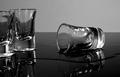
| 05/23/2003 12:31:19 AM |
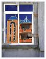
New house on the blockby JeanComment: I like the contrast between the grey foreground and the rich colored background. It looks like this two elements are fighting each other for the viewers attention. The reflection is so clear it almost seems unreal. A tiny bit more sharpness would serve this image well imho. You did a fine job on the composition. Regards, Marco. |
| Photographer found comment helpful. |
| 05/23/2003 12:25:27 AM |
|
| Photographer found comment helpful. |
| 05/22/2003 10:30:31 AM |
Her red silk scarfby jjbeguinComment: Very nice! I love the contrast of the two elements. Composition is well balanced, you gave both elements enough weight. The red border spoils this wonderful image a bit imho. Very intelligent shot!
Technique: 3/4
Composition : 3/3
Originality/meeting the challenge: 2/3
Total = 8
|
| Photographer found comment helpful. |
| 05/22/2003 09:36:24 AM |
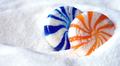
Spooning Candiesby BigSmilesComment: The brightness and the saturation of the colours work very appealing. You also did well on the composition. It's a tiny bit out of focus and there is an over-exposed area on the left of the blue candy. also, the image has kind of a magenta cast. (e.g. the shadow areas of the sugar)
Technique: 2/4
Composition : 2/3
Originality/meeting the challenge: 2/3
Total = 6 |
| Photographer found comment helpful. |
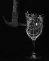
| 05/15/2003 09:08:57 AM |
Fine Wineby lumbardhComment: This is a great shot! Thanks for the info on the trigger... |
| Photographer found comment helpful. |
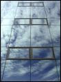
| 05/10/2003 12:05:04 PM |
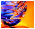
Pool of Glassby finnurComment: THIS IS GREAT!!!!! It's like a 'Gestallt' kind of thing: Looking once, you see up a church, looking twice you got a neat sci-fi surreal looking swimming-pool. Maybe after the challenge you could 'paste in' some old women in bathing in bathing-suits. ;o) |
| Photographer found comment helpful. |
| 05/10/2003 11:44:43 AM |
|
| 05/10/2003 11:42:42 AM |
|
| Photographer found comment helpful. |
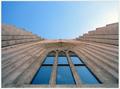
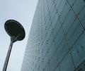
| 05/10/2003 11:38:41 AM |
The Urbisby PaulkComment: Love the angle... I maybe would have tuned up the saturation a little. But overall a nice shot. |
| Photographer found comment helpful. |
Home -
Challenges -
Community -
League -
Photos -
Cameras -
Lenses -
Learn -
Help -
Terms of Use -
Privacy -
Top ^
DPChallenge, and website content and design, Copyright © 2001-2025 Challenging Technologies, LLC.
All digital photo copyrights belong to the photographers and may not be used without permission.
Current Server Time: 04/13/2025 04:23:07 AM EDT.