| Image |
Comment |
| 05/12/2007 11:23:08 AM |
Powerby fatheroftwoComment: Hi from the critique club
What can I say, IMO this is a superb composition. I love the abstract quality. To me it advocates non-conformity. A bit like photography really many people can photograph the same subject matter but one will stand out from the rest, because of a discerning change of approach. I think that the score is reflective of DCP voters understanding and preference rather than the shot itself
I honestly cannot find fault with it, if I try to I would then disagree with myself. As you put it yourself a relatively simple manipulation has turned your shot into a great image. So many people tend to over do enhancement and kill a shot. This is spot on.
I hope you find this critique useful and I wish you good luck in future challenge entries.
Regards Rosie
|
| 05/12/2007 10:41:04 AM |
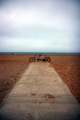
Beach cruiserby electinaComment: Hi from the critique club
I am not sure what you are trying to say with this shot. Is the focal point the tandem or the totally deserted beach?
I think your intention was to lead the viewer into the shot with the path, with the tandem being your focal point. The idea is good but the tandem is just too far away to create interest.
The sky looks a little contrasty and I wonder if you had used the selection too to select the beach/sea before adjusting the contrast that it would have left better definition to the sky
I think that changing you position would improve this shot, get closer and lower to the ground to give the shot depth and perspective. You may need to adjust the aperture depending on how you want the beach to feature within the composition. I do think that the sea seems very flat, getting low may only leave a very thin line of sea. What is really needed is to get high, but you probably do not keep a 10ft step ladder in you kit bag.
You mention that the shot was taken at dawn so make use of side light maybe angle the bike to make use of shadow. Turn the wheel into the path so that the wheel also leads the viewer further into the shot.
If I have miss judged your intentions please feel free to email and I will gladly take another look.
Above all experiments and go with your own feelings. It is originality that gets noticed.
I hope you find this critique useful and I wish you good luck in future challenge entries
Regards Rosie
|
| 05/12/2007 07:38:01 AM |
Danceby kolasiComment: Fantastic image with great composition and DOF is just right for this image. Good use of B&W too. The distraction is what appears to be a shadow across the bottom of the shot which is a real shame. = 8 |
 Photographer found comment helpful. Photographer found comment helpful. |
| 05/12/2007 07:30:53 AM |
As Go the Fish, So Goes the Cultureby xianartComment: Nice shot and composition. Good use of B&W to enphasise age. Negatives for me is the DOF I feel it is neither one or the other as it is it is distracting. IMO the background should have less focus. The crop to the top of the shot is too low and it makes the shot feel unbalanced. = 7 |
| Photographer found comment helpful. |
| 05/12/2007 04:16:03 AM |
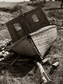
Boat's Bloody Bowby madcrabberComment: Hi from the critique club
A Charming composition in this shot.
The shadow which passes over a large part of the left hull subdues the colour and contrast of the image. Could you have moved to the right, to push the shadow back a bit? There is also a shadow under the anchor to the left which, if made more prominent would add depth and detail. You could have used the burn tool in PP to achieve this effect.
I think that the reflection in the water is wonderful and adds great texture to the image. The colour of the boat at the water edge and within the water is where the shadow cast is most noticeable and I think that use of the burn/dodge tool may have been used to even the colour shift out a little.
You could use the sponge tool to saturate the red rusty streaks as suggested in your comments but I think it is quite striking as it is.
In general this is a fine abstract shot with striking textures and colour. Your score reflects the wide variety of preference within the DPC voters and some will not appreciate its artistic quality. I think it is delightful
I hope you find this critique useful and I wish you good luck in future challenge entries
Regards Rosie
|
| Photographer found comment helpful. |
| 05/11/2007 02:55:04 PM |
Fuchsiaby Sting11165Comment: Hello from the Critique club
Composition
Not conventional in that the focal point is in the centre of the shot. You could have turned the camera to give the effect of the flower bursting into the image from the top corner. I agree with you that the green in the background really enhances the rich colour of the Fuchsia. Would it have been feasible to have added extra leaves? The blanket is a good idea and when I first looked at the shot I thought it was taken at night.
I know this flower well and I think that you encapsulate the colours superbly. Did you move the rear petal to flap over the cap of the flower? If you did it is a delicate touch and works
The distractions are the leaf in the top right (In focus) and the stem to the right hand side of the centre stamen; Simple to solve cut it off at source or clone it out.
Technical
The focus on the subject is very good with lots of detail,(which may have been even better if you had utilised the 200kb permitted in this challenge instead of 120kb) the out of focus backdrop is enhancing and works well. The lighting is good and looks to be to the left of the subject which gives the shot a nice 3D effect and brings out the almost velvet textures of the petals.
You say that you have spent a lot of time enhancing the shot and experimenting and I think your effort has been worth while.
I hope you will find this critique useful and may I just say that I adored you Kitchen ware entry. I gave it a 10 and a comment
Happy shooting Regards Rosie
|
| Photographer found comment helpful. |
| 05/11/2007 06:09:29 AM |
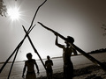
Pierce the Sun.by nephinivenComment: Hi from the Critique Club
I like the spirit of this shot and it is a very good use of Black & White.
I think that improvement could be made by
1. having a straight horizon however you may not wish to conform to that rule and this may reflect your individualism
2. Move to your camera right and down so as to knock out the leaves near the sun and to the right hand edge. I think this would also lift the shadow off the chest of the guy on the right.
3. There is something not quite right with the sun it almost looks like two shots have been used and as there is no info as to how this shot was edited it is a little hard to say what you could do to improve it.
In general I like the shot. You did not make the most of the 200kb file size and may have lost a little detail in the shadow for it. Nice definition to the contours of muscle to guy on right which is why the shadow across the chest is disappointing.
The DOF is very good and the focus is just about spot on for this shot.
I think it is just a mater of a slightly different angle would have made a real difference to the overall composition and feel of the image.
I notice that you are intending to get a D70. Good luck, I am sure you will not be disappointed. Then you may enter a few more challenges. I am keen to see more of your shots
Good luck
Regards Rose
|
| Photographer found comment helpful. |
| 05/11/2007 03:47:54 AM |
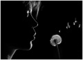
La semeuseby danielvComment: Hi from the Critique Club
First glance at this photo and I love it. I like its gentle low key feel and its effortless floating appearance. It evokes a feeling of innocence and romance.
I voted this shot a 6 during the challenge and I will try to explain my thinking in that score
I think the shot is very well composed as it the crop and the idea is extremely pleasing
For me it is the lighting which is giving a rather distracting glow along the nose and upper lip and the last few strands of hair just above the nose in particular. (I realise that commenterΟΔÄôs are praising the lighting so this is my opinion only)
This looks back lit so moving the light source is not an alternative but I think that a reflector at some distance in front of the face so it is very subtle would help soften the glow and help it float into the feel of this shot.
I also feel that the blown seeds in the air are too bright and distract from the overall sense of the shot.
I hope you have found my thoughts helpful. Please feel free to email me if you have any questions
Good luck in future challenges.
Rose
|
| Photographer found comment helpful. |
| 05/11/2007 12:39:18 AM |
A Crash Back to Realityby mistchild2008Comment: I think this shot captures the anguish of this event in the ladies face. It is a big part of todayΟΔÄôs culture, otherΟΔÄôs here on DPC may not see it that way regrettably. = 9
I think a little less contrast to take away the glare may improve this image |
| Photographer found comment helpful. |
| 05/11/2007 12:27:24 AM |
Fox in Socksby wmprkgComment: This is rather a good shot although I think the white backdrop is harsh. Also the sexuality angle does not sit well, for me, for a childrenΟΔÄôs book subject. Just a thought. And not reflect in my vote |
| Photographer found comment helpful. |
Home -
Challenges -
Community -
League -
Photos -
Cameras -
Lenses -
Learn -
Help -
Terms of Use -
Privacy -
Top ^
DPChallenge, and website content and design, Copyright © 2001-2025 Challenging Technologies, LLC.
All digital photo copyrights belong to the photographers and may not be used without permission.
Current Server Time: 04/07/2025 06:19:18 AM EDT.