| Image |
Comment |
| 11/04/2004 05:01:03 AM |
|
 Photographer found comment helpful. Photographer found comment helpful. |
| 11/04/2004 12:54:00 AM |
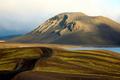
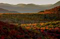
Autumn Tapestryby NeilComment: Just a bit too saturated for my tastes, but I love the the scenery and the mountains, Especially in the distance. The hints of colour there are perfect... 8 |
| Photographer found comment helpful. |
| 11/04/2004 12:50:38 AM |
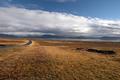
The road to Thingvellirby GautiComment: Too much foreground, not enough interest. Moving closer to the road on the left and making that more of a dominant element in your photograph would help the viewer.. use it as a leading line, not just as a secondary thought. Other than that, the exposure and details of this photo are very good. |
| Photographer found comment helpful. |
| 11/01/2004 12:54:14 AM |
Waterfront Clichéby Dr.ConfuserComment: Damn. This is good, but it was *so* close to being great. I love the blurred cruise ship. That really provides a focal point and a sense of dynamism to this shot, but it's so lost right now. Crop it just above the buildings, and you'll see what I mean. |
| Photographer found comment helpful. |
| 10/04/2004 05:10:24 AM |
The Guitaristby timj351Comment: The energy is what I like about this shot. I'm not quite as big of a fan of the grain, but I can see your intent. The close crop lends itself to this energy, but distracts from the movement of his fingers and strings -- which is where I want to focus my attention, rather than the words on his tshirt. |
| Photographer found comment helpful. |
| 10/04/2004 04:58:57 AM |
Lancing Collegeby marboComment: I really like the blue sky vs the lit college. But I think you've got too much negative space on the bottom, it overpowers the rest of the image. Taking off about an inch of the black space makes this a much stronger shot, imo. |
| Photographer found comment helpful. |
| 10/02/2004 03:25:25 PM |
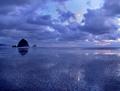
Solitudeby ZoomdakComment: I'm a sucker for these type of shots. The blue hue works well here, and I love the texture of the sand. The hints of mist around the rocks really catch my eye.. but there's something very subtle missing. I can't really put my finger on it though.
When working with water reflections, I tend to brighten up the reflection a bit.. perhaps that's what I'm looking for here? Sorry. Wish I could give a more concrete suggestion. Still, this is a solid 9. |
| Photographer found comment helpful. |
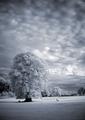
| 10/02/2004 03:19:44 PM |
hole 12, par 4by willemComment: Nice, dramatic clouds. Love the IR treatment. My only beef is that it appears noticably rotated to the left.. Details, I know... But important details.
I really like the mood and composition otherwise.. |
| Photographer found comment helpful. |
| 10/02/2004 03:17:11 PM |
The Blue Windowby aKiwiComment: Nice strong colours, good perspective. Very simple. However, for this to sing I'd love to see some texture on the wall, something to make it more than just colour. Love the composition! |
| Photographer found comment helpful. |
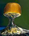
| 10/02/2004 03:15:48 PM |
The Splash of a Kiwiby terjeComment: Just plain stunning. Really like the air bubbles on the kiwi itself and in the splash. Background blur is just a hair too visible. You can see it along the right edge of the kiwi and splash..
Other than that it's great. Love the colours! |
| Photographer found comment helpful. |
Home -
Challenges -
Community -
League -
Photos -
Cameras -
Lenses -
Learn -
Help -
Terms of Use -
Privacy -
Top ^
DPChallenge, and website content and design, Copyright © 2001-2025 Challenging Technologies, LLC.
All digital photo copyrights belong to the photographers and may not be used without permission.
Current Server Time: 04/09/2025 07:57:57 AM EDT.