| Image |
Comment |
| 11/05/2005 03:53:29 PM |
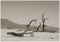
balance of natureby whiteroomComment: Greetings from the Critique Club
Very crisp and clean image nice dof here. The tones are beautiful. Lighting is perfect I don't even see a shadow in this.
As I am looking at this I almost expect to see a buzzard flying into it....it just looks so real.
I really don't see anything you could truly do to improve on this. It stands well on its own. Nicely done.
Anna |
 Photographer found comment helpful. Photographer found comment helpful. |
| 11/05/2005 03:48:27 PM |
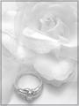
Marry me ?by kateto178Comment: Greetings from the Critique Club
Nice image and definately a delicate question to be asking.
I like your composition but wish the ring was in better focus it seems like the ring would be the most important part in asking the question the rose would just be a finishing touch so in my opinion the ring should be the focus point and be the sharpest thing in the image.
Your lighting is questionable as the white spot on the rose petal is a distraction.
Overall I like this and it has a lot of potential going for it.
Anna |
| 11/05/2005 03:43:56 PM |
Clear as Crystalby kgattComment: Greetings from the Critique Club
Ok you got delicate without a question and nailed the perspective with a limited dof by focusing only on the front piece of stemware.
I like the composition and the blue seems to add interest here.
The one flaw that my eyes were drawn to instantly was the reflection you have in that first glass its distracting. You might want to watch your light sources to avoid that...it appears to be a sliding glass door in the reflection. |
| Photographer found comment helpful. |
| 11/05/2005 03:39:46 PM |
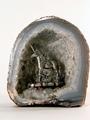
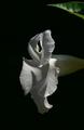
Crystals of the Unicornby jessirooComment: Greetings from the Critique Club
As I am looking at this there is one thing that stands out to me the placement. You are cropped so tight on the right side that you should have balanced it out by cropping tighter on the bottom.
Your lighting seemed to be fairly good here you only have a small amount of glare going on. You also have good detail.
I don't see a true white background though I see a bit of a pink hue, probably from working in sepia mode.
If I had to pick one thing here though that hurt you in this challenge it would be the subject...the unicorn just does nothing for me here, I'd rather be looking at more detail to the cuts than the pewter figure. |
| Photographer found comment helpful. |
| 11/05/2005 03:29:14 PM |
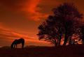
Fragile equilibriumby alithenakeComment: Greetings from the Critique Club
I don't know what to say here other than to be nit picky as to why you didn't get a ribbon cause this is an outstanding entry.
Ok I had to think a little as to why its delicate...but I did understand that. So you meet the challenge.
The lighting is good, the composition is beautiful however that fence on the right side why didn't you crop it? I tried covering up the fence and yes I lost part of the tree but then the horse seemed framed by the trees and the earth.
As I said this is an outstanding entry and I had to get really picky to even question the fence but it is something you may want to play with.
Beautiful sunset.
Anna |
| 11/05/2005 03:23:58 PM |
Mandevilla in Full Sunby BosborneComment: Greetings from the Critique Club
Nice presentation of the flower. The detail is good the lighting works well and you have a lot of potential with macros and flowers.
I do think you could improve on this in two different ways cropping being the first get rid of that leaf it just distracts when you have white and black. Second try different angles on that flower.
Best wishes on your future enteries and don't give up that was a nice first entry.
Anna |
| Photographer found comment helpful. |
| 11/05/2005 03:19:24 PM |
Waiting On the Windby brizmamaComment: Greetings from the Critique Club
Very nice image. I like the detail you have captured here excellent focus and dof is outstanding.
This definately fits the challenge well.
Your background appears to be a little to busy though to many "stripes" of color going on. |
| Photographer found comment helpful. |
| 11/05/2005 03:13:04 PM |
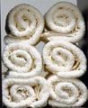
Soft & Cleanby lolor275Comment: Greetings from the Critique Club
Nice attempt at the challenge. Just one question why is that one towel on the bottom left not as neat as the rest. Amazing that is what stands out to me is that one towel.
Your lighting is a little off you have some shadows up at the top of the towels.
You have a decent amount of texture here so that adds some interest.
I would consider cropping this differently though that dark wall does nothing for this photo.
As someone else said one towel taking up most of the frame would work. It would come off as a stronger image then.
Anna |
| Photographer found comment helpful. |
| 11/05/2005 03:09:03 PM |
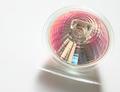
Halogen Light On Whiteby kaylaComment: Greetings from the Critique Club
I like this and I don't like this. What I like is the simplicity of it and the composition. The subject does add color to the image and that is what I find attention getting.
What I don't like is the shadow I think it hurts the photo. I also think you got a good bit of graininess going on here and I can't understand why. Your lighting seems ok other than it is casting that shadow so that wouldn't be creating your graininess. It could have happened when you sharpened it. I just know I see some graininess in the white area and some "hot pixels" in the light itself.
Overall I think its a nice image but I also think many of the voters didn't like the colors in this challenge.
Anna |
| 11/05/2005 03:02:27 PM |
EYE SPYby cheegirlComment: Greetings from the Critique Club
I don't think there is anything I can say that someone else didn't say in the comments this is just too over exposed and you lost to many details. It needs some texture as your subject matter is loaded with textures. The pumpkin skin as some texture to it but that rabbit is to far gone. It just looks like a head and a little bit of body here and there, to much of it is blended into the background.
Now that I have said what everyone else has said I do like the concept and your composition is fine its the lighting issues that really hurt you here.
Anna |
Home -
Challenges -
Community -
League -
Photos -
Cameras -
Lenses -
Learn -
Help -
Terms of Use -
Privacy -
Top ^
DPChallenge, and website content and design, Copyright © 2001-2025 Challenging Technologies, LLC.
All digital photo copyrights belong to the photographers and may not be used without permission.
Current Server Time: 04/09/2025 12:52:38 PM EDT.