| Image |
Comment |
| 07/09/2006 05:22:24 AM |
The Daily Stationeryby helloiloveyouuComment: Nicely done, brings my eye to focus right where you wanted. Try some other lighting techniques for more dramatic results. Subject matter may have people re-doing the puzzle rather than commenting on your photo. I like it. |
 Photographer found comment helpful. Photographer found comment helpful. |
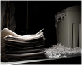
| 07/09/2006 05:22:17 AM |
Lost Evidenceby SherwinJamesComment: Nice contrast, nice use of grain, well composed. The reflection from the doorknob is distracting as is the abundance of light coming through the door. Correcting those two items would much improve this very nice photo. Cool Photo! |
| Photographer found comment helpful. |
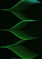
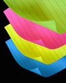
| 07/09/2006 05:22:06 AM |
Neverending Post-It Notesby ElaineComment: Well framed, looks much better as a thumbnail due to excessive noise. Grainy could look nice in another photo. Edges of the paper were well done. The greens have turned to blues in portions of the photo, which is distracting. Background would be better if it were darker. That said, nice idea, simple pattern makes a nice photo, I think you're well on your way. Good Job! |
| Photographer found comment helpful. |
| 07/09/2006 05:21:44 AM |
|
| Photographer found comment helpful. |
| 07/09/2006 05:21:36 AM |
Sixby sherpetComment: Nice composition, nice colors, nice black. Beautiful repetition. The sharpened end of the yellows and pinks are beginning to wash out and loose detail, also, harsh flash is causing reflection on the pencils to the front and back of the photo. Can you relocate the light source? Four white pixels in the black center don't do this photo justice. Otherwise beautiful. |
| Photographer found comment helpful. |
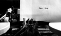
| 07/09/2006 05:21:23 AM |
Dear Momby vprndsgComment: Nice B&W. Nice lighting, great contrast. Nice texture on the ruler, paper and the wheel. The ribbon holder may be a bit too much "washed out dead space" and there is a strange square around "Dear Mom", which doesn't look like it belongs, otherwise fantastico! Keystroke in motion is a great adea, even better with slower shutter! Nice! |
| Photographer found comment helpful. |
| 07/09/2006 05:21:17 AM |
Pen to Paperby H700256Comment: Nice lighting, nice use of space, great repetition, pattern etc. Nice contrast from a simplistic pattern. The red satellites on the pen could have been removed for an amazing photo. Very well done! |
| Photographer found comment helpful. |
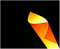
| 07/09/2006 05:21:09 AM |
Post-it Curlsby banmornComment: Simple, colorful, dramatic. Beautiful true black background. Excellent!!! |
| Photographer found comment helpful. |
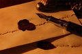
| 07/09/2006 05:10:54 AM |
Litterae De Veritasby PlachoochiComment: Beautifully done. I love the soft lighting and the texture of the paper. Nice composition, well placed articles. Nice seal. Great!!! |
| Photographer found comment helpful. |
| 07/09/2006 03:23:44 AM |
From the desk of...by dockieComment: Photo does not look natural. Logo at top looks like CGI, with tons of noise. Massive satellite inside O. Poor print type on stationery makes this photo look like it was taken with cheap camera. It's not the photographer or the camera it's the subject matter. This photo simply cannot pull off a distressed or antiqued look. Anxious to see your next submission, if you try a new subject matter you may have much better luck. Nice composition. Good idea for a shot. |
Home -
Challenges -
Community -
League -
Photos -
Cameras -
Lenses -
Learn -
Help -
Terms of Use -
Privacy -
Top ^
DPChallenge, and website content and design, Copyright © 2001-2025 Challenging Technologies, LLC.
All digital photo copyrights belong to the photographers and may not be used without permission.
Current Server Time: 04/09/2025 10:56:29 AM EDT.