| Image |
Comment |
| 12/28/2008 06:43:57 PM |
|
| 12/28/2008 06:43:35 PM |
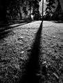
shadowlineby jdannelsComment: Wow! I love it :)
Rather than the 'light' being the theme of the image, its the shadows!
Just what's called for in this challenge!
The backs of the trees being so dark, and the grass having strong shadows help.
Good job keeping the focus on the shadow - it almost looks like a trench.
One nitpick - It would better if the shadow started from the coner of the image...
**scratch that**** diagnoal from the corner usually works as the 'theme' is what the diagnoal leads the eyes to.
In this case, the theme *is* the diagonal shadow (or its part of the theme), instead of the tree it leads to.
So its better the way you left it.
Nice :) |
 Photographer found comment helpful. Photographer found comment helpful. |
| 12/28/2008 06:38:48 PM |
|
| 12/28/2008 06:38:24 PM |
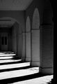
Light Geometryby MsAmbrosiaComment: Some more levels of depth/variation would help.
Even for the singular pattern of shadows, the uniformity doesnt show through... there are breaks in the shadows from the 4rd column on, that take away from the singularity of the theme. |
| Photographer found comment helpful. |
| 12/28/2008 06:36:32 PM |
Shhh!by strongsarah524Comment: The shadow needs some more contrast to draw the eyes towards it at first, not as an afterthought.
Could this be sharpened in photoshop?
Some cropping to put the shadow closer to the middle might also help.
Good concept! |
| Photographer found comment helpful. |
| 12/28/2008 06:34:45 PM |
We three kingsby jellybellyComment: Nice choice of background to match the color of the dummy - or was the flash filtered to be orange?
I notice some low-iso noise, but that could be my monitor :)
The shadows need much more contrast - something hard to do, as a brighter light source for one shadow would probably make the other shadows lighter.
However, a directional spotlight with some tinkering should help...
Great concept, maybe better execution? :) |
| Photographer found comment helpful. |
| 12/28/2008 06:31:18 PM |
A Shadow of his Former Selfby GenrOneComment: Nice positioning of the letters - can read just enough.
It'd be nice if the face were turned a little more, so that some shadows on the face would stand out. Might be hard due to the spring attachmnt, but should be possible :) |
| Photographer found comment helpful. |
| 12/28/2008 06:30:04 PM |
eternityby halopesComment: Does give a 'grim' look, but maybe not as haunting as desired.
Perhaps if the camera was close to the ground, and a wider lens was used,
it would make the shadow in the foreground more threatening.
The shadows should be the first thing to catch the eye, but the brightness & positioning of the facing surfaces make you see the shadow later. |
Home -
Challenges -
Community -
League -
Photos -
Cameras -
Lenses -
Learn -
Help -
Terms of Use -
Privacy -
Top ^
DPChallenge, and website content and design, Copyright © 2001-2025 Challenging Technologies, LLC.
All digital photo copyrights belong to the photographers and may not be used without permission.
Current Server Time: 04/08/2025 12:26:47 AM EDT.