| Image |
Comment |
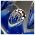
| 05/01/2007 11:18:02 AM |
blue and whiteby bvlindalouComment: The reflections in the bubble are a bit to bright. I think it would have been better if I could not see the room reflected. You could of controlled the reflections by using a strategically placed piece of card or a sheet. |
 Photographer found comment helpful. Photographer found comment helpful. |
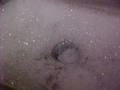
| 05/01/2007 10:59:56 AM |
Drain, Drain Go Awayby ScubaSteve13Comment: I'm not sure what you were trying to achieve here. The image has problems on every level. I would suggest reading a few beginner articles and perhaps asking in the forums for specific help if you get stuck. People are always willing to help those who are genuine in their desire to learn. |
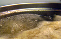
| 05/01/2007 10:58:26 AM |
Chicken Stockby okiesisiComment: A slightly faster shutter speed would have helped to freeze the motion of the bubbles and make the image more interesting. The focus is probably to far back as the edge of the pan is good and sharp but that is not the main subject. A spotlight or similar shone directly on the bubbles would likely have helped to give it more drama. |
| Photographer found comment helpful. |
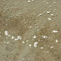
| 05/01/2007 10:58:00 AM |
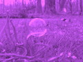
low tideby whiterookComment: A simple image that is all about texture. Unfortunately it lacks the absolute clarity that an image of pure texture absolutely needs. I think part of the problem is the focus is slightly off, however the biggest thing that strikes me is the lighting. It looks as thought the image was take around midday, judging by the shadow of the bubbles. Midday usually produces uninspiring lighting as the shadows are very short and textures appear flat. This shot done again when the sun is much lower in the sky would produce a far more pleasing result I'm sure. With natural light it is all about timing. |
| Photographer found comment helpful. |
| 05/01/2007 10:57:08 AM |
Cramming For Finalsby GeneralEComment: Lol... The lighting seems a little flat and dull. The ribbon/rope thing doesn't seem to do anything for the image yet it is the first thing I saw. |
| Photographer found comment helpful. |
| 05/01/2007 10:56:53 AM |
The Bubblerby manukarunComment: I think this would have been better if you had got closer into the subject. Framing just the bubbles and the mans face and cutting out the lower body that does nothing for the story would have given it more intimacy. |
| 05/01/2007 10:56:16 AM |
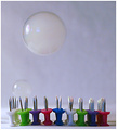
Slim Chanceby LaMasComment: A creative idea! I like the use of coloured pins and the fact that they are not perfectly aligned. The image seems rather noisy (grainy) which is likely the result of a high ISO. Using stronger lighting will allow the camera to use a lower ISO and help to reduce the graininess. |
| Photographer found comment helpful. |
| 05/01/2007 10:55:55 AM |
Just simple...by katamaresComment: Shining a light into the side of the glass may have helped to give this image a little more pop. |
| Photographer found comment helpful. |
| 05/01/2007 10:55:44 AM |
bubblefunby kerilittleComment: It's a shame about the white thing (a car?) in the background. It is important to watch for distracting things like that. |
| 05/01/2007 10:55:26 AM |
Pretty Bubbleby Salo8899Comment: This image has a nice composition and feeling. The colouration seems a little over done to me, subtler would have been better I think. There is also a lack of contrast for such a bold colourization choice. The contrast may have been ok with a subtler image. |
| Photographer found comment helpful. |
Home -
Challenges -
Community -
League -
Photos -
Cameras -
Lenses -
Learn -
Help -
Terms of Use -
Privacy -
Top ^
DPChallenge, and website content and design, Copyright © 2001-2025 Challenging Technologies, LLC.
All digital photo copyrights belong to the photographers and may not be used without permission.
Current Server Time: 04/07/2025 06:08:47 AM EDT.