| Image |
Comment |
| 01/20/2003 08:07:32 PM |
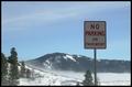
No Parking Any Timeby nledfordComment: I like the background blurred it would have been to busy otherwise, but the sign seems to be a bit too blurry also. Did you try to sharpen it using PS or PSP? You may want to try a few different angles also. I personally don't care for things perfectly centered (well every once in a while) usually they are not as appealing to my eyes. The sign was OK, it is very hard to find any interesting signs around, but then again a different angle may have helped give the sign a bit more pizzazz. 4. |
| 01/20/2003 07:21:53 PM |
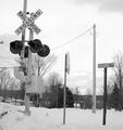
Advance to the nearest railroad...by RiderGalComment: Railroad crossing on railroad Ave., Geez they were sure inventive when naming that road. I like the black and white effect, colors would not give the crossing sign as much contrast. Good job with the focus ont he subjects int he fore ground, the background is a bit busy and distracting though, did you try blurring it out at all, or play with the saturation levels? Sometimes you can get rid of annoying wires with a little toying around. 7. |
 Photographer found comment helpful. Photographer found comment helpful. |
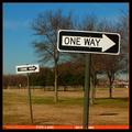
| 01/20/2003 07:06:34 PM |
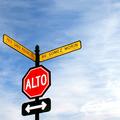
...or another!by crabappl3Comment: I gonna find ya...... sorry just couldn't resist. Very catchy title. I really like how you drew the red color from the shot to the border, but my attention is drawn to that part of the picture first, I don't know if that was your intention or not. I like the depth both of the signs create (the fire lane does help with this also), and you kept the 2nd sign in focus, I like that. There is something that bothers me about the colors though, mabey a bit too yellow, can't totally put my finger on it right now. Was it a hazy day? There is also red spots all through the trees which doesn't look natural, you may have over saturated the red a bit too much. I figured you saturated it to get the effect with the fire lane. If you did, that may also be causing the color problem.
Overall I like the effect with the fire lane, but I feel your colors were a bit off. Thanks for reading my ramblings. 8. |
| Photographer found comment helpful. |
| 01/20/2003 06:51:10 PM |
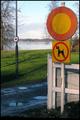
Just Humansby MonaComment: Cool signs! I liked how crisp the focus was onthe forward signs, but the no horse sign, I would have liked to se a bit more in focus, for the rest I like the blur. My attention is drawn to the other sign for it also tells part of the story here, that is why I would like to see it a bit crisper. The colors are great, just wished the sky would have cooperated that day and given a deeper blue. 8. |
| Photographer found comment helpful. |
| 01/20/2003 06:41:39 PM |
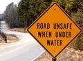
DUH!by MustbelostComment: What a good find for a road sign, this one gave me the giggles. Your focus was very good, sharp on the main subject and then goes fuzzy in the background. The road trailing on the left is a nice touch, but I think it is cropped a bit too close. Overall good job.8. |
| Photographer found comment helpful. |
| 01/20/2003 06:08:51 PM |
Paved with good intentions.by RuchartComment: The road to hell.......Great shot I really like the saturation effect with the green and greyed out background. The angle is just great, gives it a really cool perspective. The trees are a bit washed out, but not too bad.9. |
| Photographer found comment helpful. |
| 01/20/2003 04:54:36 PM |
Roadlessby falveyComment: Pavement, I see no stinking pavement. j/k Very cool shot I just love the fog. It kinda makes the shot a bit blurred. The placement of the sign in relation to the mountain and horizon is great. I may have improved the lighting somehow. The sign seems to be a tad too dark. I am not sure now that it is just the fog that blurred everything, the sign seems a touch fuzzy too. Overall great shot.8. |
| 01/20/2003 04:33:51 PM |
First Stopby emagenComment: Cool placement and perspective in this shot. The colors are just extrordinary and the focus is very sharp.! My only suggestion would be to hack just a bit of the sky off, I played with the scroll wheel (acts like a crop tool) and I really like about 3/4 of an inch of sky gone, puts the more attention on the sign and is more appealing to my eyes. 8. |
| Photographer found comment helpful. |
| 01/20/2003 04:24:29 PM |
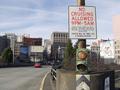
No cruising till 6:00 a.m.by justineComment: Really neat sign photo. Your placement of the horizon/sign pole is excellent, very pleasing to my eyes and interesting. There seems to be a bit of a focus problem, the small print on the sign is pretty unreadable The background is fuzzy too, which might have been your intention, but then I would prefer a bit more blur. 8. |
| Photographer found comment helpful. |
| 01/20/2003 04:08:02 PM |
Noisy Passengersby Geo_GriffinComment: Too funny a sign. My suggestion would be to not place it center/off center as it is. Give it more of a perspective by taking the shot at a different angle. Good focus on the shot. The trees in the background neither add or detract from the shot I don;t know if you tried a shot with them blurred out or not, that may have been neat too. Overall cool sign and great pic. 8. |
Home -
Challenges -
Community -
League -
Photos -
Cameras -
Lenses -
Learn -
Help -
Terms of Use -
Privacy -
Top ^
DPChallenge, and website content and design, Copyright © 2001-2025 Challenging Technologies, LLC.
All digital photo copyrights belong to the photographers and may not be used without permission.
Current Server Time: 04/11/2025 12:13:15 AM EDT.