| Image |
Comment |
| 01/21/2003 05:57:50 PM |
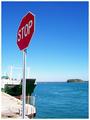
The Obvious!by GraciousComment: Yeah hmmm lets drive into the water. Good find for a sign :) I like the placement and angle of the stop sign, just wish the boat was not so close in the background, it really takes your attention away from the sign. The colors are bright and vivid and the focus is very good on the sign. To my eyes there seems to be a bit too much dead space, but the overall effect works for the shot.7. |
 Photographer found comment helpful. Photographer found comment helpful. |
| 01/21/2003 05:06:55 PM |
Crossroad Trafficby juhaseilaComment: Interesting combination. Great job on the focus for the speeding plane. I would like to have seen the whole sign though, but I am sure it was hard enough just catching the plane. THe only problem with the plane is that it is the center of attention, I only see the sign as an after thought. 7. |
| 01/21/2003 04:20:37 PM |
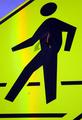
Nailedby jmsetzlerComment: Very unique take on the roadsign challenge. I like that it is different, and understand why the whole sign could not be included, I think that it is enough the figure was there. I don't reallyI like the rainbow effect going through the middle of the shot though it is a bit distracting. I can't believe the amount of detail you were able to pick up even down to the honeycombs (a bit tricky on the eyes though).7. |
| 01/21/2003 04:04:46 PM |
Vintageby auroraComment: Very neat road sign find. It is a bit hard to read, but that just adds to the feel of the age. The focus is excellent on the very very sharp on the sign :). I keep debating whether I like the road in the shot or not. It adds to our understanding that it is a road sign, which without some would probably question, but if it wasn't for this fact I would have left the road out. Overall though, I like the change from all the traditional road signs. 7. |
| 01/21/2003 03:51:13 PM |
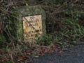
cow sex prohibitedby Pep VentosaComment: This shot is just too funny. Did you try to get an angle without thiose powerlines? They are a bit distracting and lead your eyes no where. The sharpness/focus is ok, the top of the sign seems to be a bit fuzzy, but that could be due to the bright sky. 7. |
| 01/21/2003 03:29:38 AM |
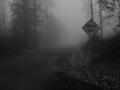
Onward by AlecComment: Wow that just looks so gloomy. Dead end says it right. I think you could have done a closer crop though, it would have brought more attention to the sign, but still have been able to maintain the effect. This shot may also have been kinda neat with desaturation, only keep the yellow of the sign, and maintain the rest as it is now. That too would have drawn a bit more attention. I likethe placement of the sign though in this pic, and your focus was great especially for conditions like this. Back to cropping I probably would have cropped a bit off the bottom too, get the horizon out of the middle of the picture and lose the unneeded leaves and pavement onthe bottom. Great shot though, it is just so freaky. 8. |
| 01/20/2003 09:18:49 PM |
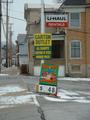
They Got Everything at the Corner Storeby OneSweetSinComment: I am not too sure if I would have gone with framing htre shots in center, especially with your title, it would have been nice to get the signs and also catch a glimpse of the store itself. I probably would have tried to use the rule of thirds and used the pole to create the left quadrant. That would have also reduced the distracting street/poles on the left currently. The focus is also a bit off on the signs also. This shot does have potential, I just personally would have liked it executed a bitdifferent.3. |
| Photographer found comment helpful. |
| 01/20/2003 09:01:36 PM |
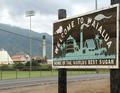
Sweet Inspirationby CubComment: I like the angle you chose for the sign, but with the background, it lead my eyes right to some ugly and distracting poles and wires. It makes me wonder why you chose this angle and to include the plant and everything else on the background (Sugar plant?). I would like to have seen the whole pole on the left too, the way it is, it is cropped too close. The sign itself is in good focus, and I like the lighting, not too light or dark. 6. |
| Photographer found comment helpful. |
| 01/20/2003 08:36:46 PM |
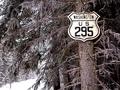
Look what I found in Canada,of all places.by camelotnorthComment: There we go again trying to ruin my favorite vacation land. Very interesting place to find a road sign,though it makes for a cool shot. The tree makes a perfect pole, much more interesting than a piece of steel. Your framing of the sign was great, really makes the sign stand out. Lighting and focus was also exceptional. The colors are OK I understand it is winter not much color to be found anywhere. 7. |
| Photographer found comment helpful. |
| 01/20/2003 08:29:04 PM |
Puppy's Noseby cassberComment: I am a little confused as to why this shot is in the road signs competition. |
Home -
Challenges -
Community -
League -
Photos -
Cameras -
Lenses -
Learn -
Help -
Terms of Use -
Privacy -
Top ^
DPChallenge, and website content and design, Copyright © 2001-2025 Challenging Technologies, LLC.
All digital photo copyrights belong to the photographers and may not be used without permission.
Current Server Time: 04/11/2025 12:13:12 AM EDT.