| Image |
Comment |
| 08/30/2006 08:43:32 AM |
Three Gracesby ZoomdakComment: Great image. The composition works well with the moon centered thoug I'm curious how it might look if cropped in from the left near the tree. It's unfortunate that there is a little halo around the moon though. Not sure how to fix that with basic editing, but certainly fixable in advanced.6 |
 Photographer found comment helpful. Photographer found comment helpful. |
| 08/30/2006 06:44:43 AM |
Horizon Silhouetteby mnouwensComment: Very nice layers of color... I just wish it the horizon was sharper. Could also use some noise reduction just to smooth it out a little bit. |
| Photographer found comment helpful. |
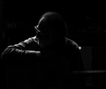
| 08/30/2006 06:38:41 AM |
T H E G U I T A R I S Tby NaldComment: Very nice silhouette portrait.... I would have liked to have seen just a tiny bit more detail in the guitar as with out the title, I wouldn't have really known was there. The light oulining the face and shoulder is really nice and crisp. |
| Photographer found comment helpful. |
| 08/30/2006 06:35:24 AM |
Simply Meby angela_packardComment: I like it. There is just enough detail on the model's hip to show some shape which is really nice. the only thing I'm not so sure about is her bracelet (I think) and the shoes... Nice job! |
| Photographer found comment helpful. |
| 08/30/2006 06:33:50 AM |
Summer's Slow Retreatby LucidLotusComment: Beautiful image! A small clockwise rotation would help balance out the horizon. As it is, I feel like I'm sliding off of the composition to the left.6 |
| Photographer found comment helpful. |
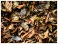
| 08/28/2006 12:06:58 PM |
Wasting Awayby L1Comment: I love this image! It's beautiful, the colors are balanced well, and it has a very dramatic feel. I especially like the bit of green on the leaf just right and up of center.... I wasn't sure about it at first and thought about suggesting that it be changed to blend in, but after thinking on it some more, I like how it contrasts conceptually with the dried up leaves. |
| Photographer found comment helpful. |
| 08/28/2006 08:06:27 AM |
|
| Photographer found comment helpful. |
| 08/28/2006 07:16:21 AM |
|
| Photographer found comment helpful. |
| 08/26/2006 07:11:57 PM |
Telekinesisby TallblokeComment: Great idea! The pencil looks a little weird- there is a dark blue outline around it which is a bit distracting and makes the pencil seem too far removed from the scene... might be more effective if the model's hand and pencil were both in focus? |
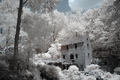
| 08/26/2006 07:09:22 PM |
Fantasy Cabinby PhomComment: Very nice image, the de-sat is really cool. Would like to see it a bit bigger- would suggesting taking advantage of the full 640 pixel width allowed. 8 |
| Photographer found comment helpful. |
Home -
Challenges -
Community -
League -
Photos -
Cameras -
Lenses -
Learn -
Help -
Terms of Use -
Privacy -
Top ^
DPChallenge, and website content and design, Copyright © 2001-2025 Challenging Technologies, LLC.
All digital photo copyrights belong to the photographers and may not be used without permission.
Current Server Time: 04/07/2025 06:11:39 AM EDT.