| Image |
Comment |
| 02/19/2003 08:15:16 AM |
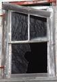
Reflectionsby DoorskidderComment: I like the idea you tried to achieve. If you were making yourself Waldo then you were successful in meeting the challenge. There are several things that if done differently your score would have been higher. 1. Try and create a different point of view than straight on. 2. Get a reflection of someone other than yourself shooting the picture. This makes it look like an accident. 3. When you decide on your shot try and find a time that you can get the best lighting possible. This will make your colors richer and your reflection more powerful. Luck is a big part of photography, but sometimes you need to plan your shot and then if everything works perfectly, which is where the luck comes in your get that winning shot. Good luck in the future. John Gill |
| 02/19/2003 07:19:20 AM |
A Window-cleaner's Nightmareby FranziskaLangComment: I am a purest when it comes to photography. I don't even like to crop my pictures. So when I read your personal comments I was a little disappointed in how much altering of the origional picture you had done. I checked out the origional photo and that one I would not have graded as high. This of course is a personal opinion. So leaving my prejudices out of this I shall comment. I am really big into using the elements of design to create fantastic photographs. Your point of view, perspective, lines, shapes and forms, pattern, reflection,and texture,makes this picture come alive. The rich blues vs the gray stones make for a dramatic contrast. The curvature of the columns gives the picture some depth. Very sharp image and excellent cropping. What I appreciate the most is the fact that you have an eye for the beauty that surrounds us all and then you were able to capture it using the camera. Great job! JOHN GILL |
 Photographer found comment helpful. Photographer found comment helpful. |
| 02/13/2003 10:15:57 AM |
hit the point...by neoathematrixComment: You have some very good things going on in this picture. Point of View, Depth of Field, shooting at a slow speed to create movement, the use of Lines and Shape and Form. I understand you wanted a sunset picture, but the lighting leaves to many ares dark that distracts from the overall image. I also encourage my students not to have their vanishing point centered. That makes your picture like a bullseye and doesn't allow your eye to wonder around the whole image. Keep up the good work and don't give up on the sunset time frame. It may not have worked perfectly for this image, but it is one of the best times of the day to take quality pictures. JG |
| Photographer found comment helpful. |
| 02/13/2003 09:03:06 AM |
Frozen Dreamsby arnitComment: Your colors are excellent and the lighting is very good, I like the hint of shadows on the flowers. The dark background with just enough light falling on the leaves adds that extra touch to make your photo exceptional. To take this photo to the next level you would need to work on the composition of the picture. Using two flowers is extremely difficult to work with. A basic rule is to use odd numbers to help balance the picture. This could be done is several different ways. One would be to overlap the two flowers and have the leaves be your third image. Of course another flower would also do the same thing as long as they were not laying in a row. Placing the flowers on a mirror can do the same thing but this idea has been over used. None the less, your picture was one of my favorites mainly because you took an over used topic, (flowers) and took it to a new level. Great job. JG |
| 02/13/2003 08:49:48 AM |
happy babyby shutterflyComment: As I'm sure you are aware taking pictures of babies can be difficult. Using a flash instead of available light makes it even more difficult because of their light colored skin and eyes. Something else you might encorporate into your photos is props. These items can help tell a story or add depth to a picture. Taking pictures of babies is so challenging because as one of the treads said, "Everybody has a million of these." So the competition is tough and planning is the key. Luckily you have a sweetie to photograph which gives you an edge. Now, how can you make your picture different than anyone elses? Quite the challenge.JG |
| Photographer found comment helpful. |
| 02/13/2003 08:29:42 AM |
Boboby EisbaerComment: Welcome to the club. For your first digital image you did a great job. I like the close up and the composition of the picture. Placing the parrot over on the right side instead of the middle works very well. The cage on the left of the picture creates a nice pattern, I wouldn't change that at all. Two things could be changed that would help. If you toned down the light a little you would not have the glare on the beak. The other would be to use more than one light. The shaddow on the back wall is distracting. You could have used a back light to wipe that out or move the cage so the shaddow has nothing to rest on. Keep up the good work, I'll keep an eye out for future work. JG |
| Photographer found comment helpful. |
| 02/13/2003 05:34:40 AM |
Triangles?by jab119Comment: Good perspective and use of line to create your composition. |
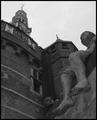
| 02/13/2003 05:28:54 AM |
Shipmates of Bontekoeby AzrifelComment: Great perspective and composition, lighting is dark and the light at the top of the building is distracting. Another time of day would have allowed for better lighting or some creative shadows. |
| Photographer found comment helpful. |
| 02/09/2003 04:22:51 PM |
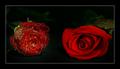
Broken Reflectionsby KazComment: Nice all around image. The shapes and forms, reflections, contrasts, and especially the combination of textures really makes this a photo
of high quality. It's a shame the red in the upper half of the picture was not a little richer. that would have really set the photo off. The composition might be a little tight. I would have liked to have seen all of the hinges, but only you know if that would have worked or distracted from the image. I would like to see this done in black and white. Black and white phototgraphy is one of my passions and if you would not mind emailing me that image I would appreciate the effort. Thanks, John Gill |
| Photographer found comment helpful. |
| 02/07/2003 06:18:17 AM |
Lacquerware Abstractionby jitamsComment: Very effective use of space, shadow, color, shape, and lighting. The simplicity of the image and yet it's powerful striking visual effect work great together. Excellent composition. I find it interesting that you would use an abstract image as an idea for a photograph. Especially one that is reasonable flat. A photograph by nature is two dimensional, highth and width. By photographing something that is flat this does not change the nature of the picture. If this was done on purpose, I would be interested in knowing why. Otherwise I would try and make it look more three dimensional to give it depth. None the less, this pic is very dynamic and worthy of a much higher score than 6.03. Keep up the creative thinking and good luck in future challenges. John Gill |
Home -
Challenges -
Community -
League -
Photos -
Cameras -
Lenses -
Learn -
Help -
Terms of Use -
Privacy -
Top ^
DPChallenge, and website content and design, Copyright © 2001-2025 Challenging Technologies, LLC.
All digital photo copyrights belong to the photographers and may not be used without permission.
Current Server Time: 04/09/2025 12:52:47 PM EDT.