| Image |
Comment |
| 11/13/2006 09:17:21 AM |
|
 Photographer found comment helpful. Photographer found comment helpful. |
| 11/13/2006 09:14:16 AM |
Quadby L2Comment: I don't know if this is just my screen, but it looks greeny/blue. I like the pattern and the simplicity and I can almost smell the smoke.6 |
| Photographer found comment helpful. |
| 11/13/2006 09:10:28 AM |
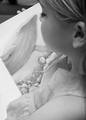
A Calm Sunday Afternoonby Physics_GuruComment: You're lucky. I'll send mine around for some calming down as well! I like the way the child appears part of the book scene by virtue of the similar shading. I think the view straight down her ear seems not quite right, but her eyelash is gorgeous.7 |
| Photographer found comment helpful. |
| 11/13/2006 09:05:44 AM |
Jimmyby blemtComment: The subject matter makes this poignant and there is a good coverage from white through to black.7 |
| Photographer found comment helpful. |
| 11/13/2006 09:02:10 AM |
Grey Day on the Beachby tembaComment: I think it could do without the person in the distance as the feel of the photo is that you are there alone, which I like. Did you use a red filter? If not I think it would have helped those thin clouds show up a bit better. The timber gives a nice contrast against the dull sky and I like the composition.6 |
| Photographer found comment helpful. |
| 11/13/2006 08:54:21 AM |
Not Yellow?by stare_at_the_sunComment: Just a bit too blown out on the left cheek and part of the banana, but an amusing photo nonetheless. Great hair and eyes give this an Einstein look and makes me want to look a little longer.7 |
| Photographer found comment helpful. |
| 11/08/2006 02:51:03 AM |
portrait of a girlby danica22Comment: Lighting a tiny bit flat. Looking up has made you tilt your face up juuust a bit too much, but the overall pose is sophisticated and at the same time almost daring people to approach you. Lips slightly apart is good and hair gives the "don't approach me" look support. Good in B/W and clothes and background suit that well. I like it a lot |
| Photographer found comment helpful. |
| 10/31/2006 07:12:54 AM |
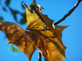
Arrival of Autumnby iamthirdComment: If you stare at the leaf long enough it is almost a bat flying past. The concept is good, but you need some more leaves in the background to reduce the blue, which is a bit too unvaried in colour. You had the start of lovely contrast at the top curl of the leaf and where the stalk (twig) goes to the top right corner. Imagine a bit more of that and the effect it would have had on the leaf! And of course everyone else would have told you that your pic should have been bigger than 374x281 for better effect. I look forward to your next one.6 |
| Photographer found comment helpful. |
| 10/22/2006 09:52:52 AM |
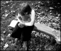
Alone Togetherby pocketedComment: The left of the bench as we look and the blouse are a bit blown out, but a nice range of pure black to white. Otherwise a lovely mood which pulls at the heart strings. 7 |
| Photographer found comment helpful. |
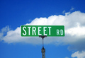
| 10/22/2006 09:44:41 AM |
Street Roadby RompyComment: I think this would have looked good in black and white with a red filter to define the cloud better and with the sign away from the centre of your picture. 5 |