| Image |
Comment |
| 02/07/2008 09:14:21 AM |
Mercedes-Benz: Only the Bestby maranelloboy05Comment: Nice lighting and shot, the problem I have with this is that you cannot make out the hood ornament on the car from this angle. Granted most people will know what it is, nut their logo means ALOT. Specks of light in the black on the right of the car are a little wierd. Nice shot overall though |
 Photographer found comment helpful. Photographer found comment helpful. |
| 02/07/2008 09:13:05 AM |
|
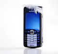
| 02/07/2008 09:12:05 AM |
Feather-likeby sekarmalathyComment: Pretty, Colors are great, feather looks nice, but makes the text up on top just a little harder to read- may be bad for advetising. Also, I really want to see some of the features ON the screen of this phone. The reflection glare in the bottom right corner of the screen would need to go as well. Sorry if it feels like I'm critiquing this harshly, it just has a lot of potential! Still a strong shot overall |
| Photographer found comment helpful. |
| 02/07/2008 09:10:08 AM |
Cascade: a smooth and refreshing drop.by StagoleeComment: Good staging and shot. Nice exposure, DOF. My only thought is that most advertising would want the smaller text on the label to be more readable- as it is a big part of their product. Still will get a good score from me. Nice shot |
| Photographer found comment helpful. |
| 02/07/2008 09:09:00 AM |
|
| Photographer found comment helpful. |
| 02/07/2008 09:07:45 AM |
Tea - Best Drink of the Dayby TacTZillaComment: Just doesnt seem like much of an advertising shot to me... Lighting on the model is deent, though some of the photo seems a little muddy. The second person in the background is just a little distracting as well. |
| Photographer found comment helpful. |
| 02/07/2008 09:06:20 AM |
iWall - Giving life to almost each houseby BrokenPelvisComment: Great shot, but I question this very strongly for basic editing. The tones and textures are great, and its very simple. I love the shot, and will score it nicely, but THINK that there is probably to much editing |
| Photographer found comment helpful. |
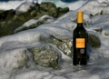
| 02/07/2008 09:05:17 AM |
Rock Winesby KarenNfldComment: The lighting on this seems awefully flat. Its a good, but simple idea. Maybe some different crops, angles would have helped. |
| Photographer found comment helpful. |
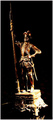
| 02/07/2008 09:04:38 AM |
Lone Antic Knightby rezaira2002Comment: Lighting is just too harsh in the bottom right corner, and too dark in some areas (left leg). I guess I dont really understand what you are advertising either |
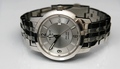
| 02/07/2008 09:03:48 AM |
Tissot. Keeping time since 1853by hsvhoonComment: DOF is nice, lighting needs a little on the face of the watch. Also, look at all pro pictures of watches.... Hands almost ALWAYS go 10:00 and 2:00- it frames the brand of the watch |
| Photographer found comment helpful. |
Home -
Challenges -
Community -
League -
Photos -
Cameras -
Lenses -
Learn -
Help -
Terms of Use -
Privacy -
Top ^
DPChallenge, and website content and design, Copyright © 2001-2025 Challenging Technologies, LLC.
All digital photo copyrights belong to the photographers and may not be used without permission.
Current Server Time: 04/12/2025 07:18:17 AM EDT.