| Image |
Comment |
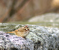
| 01/22/2007 07:33:46 AM |
Here's Looking at You, Kidby scottiehamComment: Perhaps a little too much contrast or sharpening since the texture/light on the rock seems a little much, at least in balance with the blurred background. I dont think the negative space at the top of the image really help overall and cropping it out puts more emphasis back on the bird. Additionally without the blurred background the texture of the rock is no longer competing with the bird and they seem to blend well together. |
 Photographer found comment helpful. Photographer found comment helpful. |
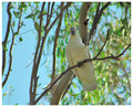
| 01/22/2007 07:29:06 AM |
Gimmie a five!by KitaComment: It looks like the light was above/behind the subject and as such has made the subject somewhat underexposed. The light refractions/halo in the background trees are also a little distracting due to their brightness/color. |
| Photographer found comment helpful. |
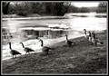
| 01/22/2007 03:54:04 AM |
seven geese a posingby Shan2112Comment: The overexposed ice/snow on the water really detracts from the geese. I like the texture of the mud and the diagonal segment of it, though. |
| Photographer found comment helpful. |
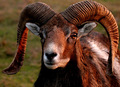
| 01/22/2007 03:51:41 AM |
Little Big Hornby ace flymanComment: I like how the warm glow of the light adds texture to the horns. I think moving a little to either get both eyes prominent (ie the left eye not so dark) or else just having the one that is brightly lit. The shot is a little static and very tightly boxed in. |
| Photographer found comment helpful. |
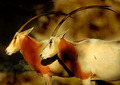
| 01/22/2007 03:48:00 AM |
Scimitar Oryxby JeffryZComment: I like the repetitive pattern. The warm tones are interesting too. Not sure if you added some noise to the image too but it has a very textured feel to it. An interesting, artistic rendition. |
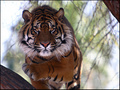
| 01/22/2007 03:45:33 AM |
North Sumatran - Silent Strikeby robaComment: The stare is great and intense, although if you dodged the eyes you should avoid or burn back the black otherwise they look a little washed out. The lifted paw makes it a little more dynamic too. What's killing the image is the background. The unusual, overly-bright background is just stealing the attention from the tiger. After looking at it for a while it recedes but the first initial reaction is bad. |
| Photographer found comment helpful. |
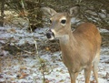
| 01/22/2007 03:40:15 AM |
Far Away Lookby gdob27Comment: The choice of DOF has made the background quite busy. There also seems to be a significant noise issue. The crop cuts off the legs, which isnt ideal either. You'd want to either have the whole animal in the shot or less of it. |
| Photographer found comment helpful. |
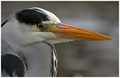
| 01/22/2007 03:37:49 AM |
The Heronby silverscreenComment: Great job on getting a close-up! Sharpness is great on the beak and some good texture on the feathers. The crop is good although the image itself is a little static. Ideally would have been better with a catchlight too. |
| Photographer found comment helpful. |
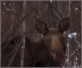
| 01/22/2007 03:35:08 AM |
Mystic Mooseby ShutterPugComment: Seems quite blurry and noisy, although there is something about it that is appealing. Technically not so great, but I like it. |
| Photographer found comment helpful. |
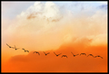
| 01/22/2007 03:33:14 AM |
In-Formationby h2Comment: I like the graduation in color - it really adds something and makes it a little more heavenly. I almost want to try and decipher if they are spelling something :P Minimalist and appealing. |
| Photographer found comment helpful. |
Home -
Challenges -
Community -
League -
Photos -
Cameras -
Lenses -
Learn -
Help -
Terms of Use -
Privacy -
Top ^
DPChallenge, and website content and design, Copyright © 2001-2025 Challenging Technologies, LLC.
All digital photo copyrights belong to the photographers and may not be used without permission.
Current Server Time: 04/07/2025 06:12:29 AM EDT.