| Image |
Comment |
| 10/16/2007 08:44:11 PM |
Pencil Noodles? Nope. Rice again!by jsundinComment: I don't really like how the stamp on the pencil is visible, but I figure it was a conscious decision to avoid ridiculous DNMC claims.
Nice colours and good contrast. Composition is good, but the perspective could've been a bit more interesting. |
| 10/16/2007 08:41:56 PM |
matchby jilly_mComment: Image could've been bigger. The pencil would have been better placed a bit to the left, and the image could've been composed so the extension of the pencil was not visible. There are too many things that needed to be done to improve this image. |
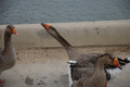
| 10/16/2007 08:39:49 PM |
I Haven't Seen Your Stupid Pencilby David EyComment: One could argue that--based on the title--the subject of this image is the pencil. However, the wording of the title makes the bird the subject ( I haven't seen ..."), and things get even worse if you go solely by the image (there's no pencil at all).
With that aside, the image has nice colours, good contrast, and is composed fairly well. The expressions and timing are nice, but it's not the most exciting image. |
 Photographer found comment helpful. Photographer found comment helpful. |
| 10/10/2007 07:19:13 PM |
Backyard Lightby jdannelsComment: Very well done. Nice colours and exposure throughout. The composition is excellent (with the sky on the bottom, it makes you think). |
| Photographer found comment helpful. |
| 10/08/2007 10:08:10 PM |
halloween-spinnerby sfaliceComment: Wow. 98% of the image is blurry, and yet together with that 2% that you kept sharp it makes for a great image. I'd say boost the saturation a good bit, but other than that you've captured an excellent shot. |
| Photographer found comment helpful. |
| 10/08/2007 08:30:22 PM |
|
| Photographer found comment helpful. |
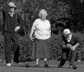
| 10/08/2007 08:29:32 PM |
Take a Hikeby Pipe_DreamComment: Nice background and good composition of the group. They could use some fill flash, but overall a pretty good group portrait. |
| Photographer found comment helpful. |
| 10/08/2007 08:28:43 PM |
Action at the weddingby kiskatComment: The way this is composed, it looks like the videographer has a mohawk. The girl with red hair, who I presume is your subject, is blurry in the face. There's also a distracting reflection up in the top left corner. The image could use some sharpness, in my opinion, along with either a boost in colour or simply a conversion to B&W. |
| Photographer found comment helpful. |
| 10/08/2007 08:23:11 PM |
Company by alyamiComment: Interesting way to photograph the staff, but the people in the back aren't visible and those along the edges are stretched. When shooting wide angle, people should never be placed near the edges of the image. |
| 10/08/2007 08:22:02 PM |
The Three Amigosby TacTZillaComment: Good use of differing heights for your composition, but the fact that they're looking into the sun doesn't help the photo. |
| Photographer found comment helpful. |
Home -
Challenges -
Community -
League -
Photos -
Cameras -
Lenses -
Learn -
Help -
Terms of Use -
Privacy -
Top ^
DPChallenge, and website content and design, Copyright © 2001-2025 Challenging Technologies, LLC.
All digital photo copyrights belong to the photographers and may not be used without permission.
Current Server Time: 04/07/2025 06:31:21 AM EDT.