|
|
| Image |
Comment |
| 11/08/2007 04:38:08 PM | University of Maryland team takes second place in Solar Decathlonby JBHaleComment: Hi from the Critique Club,
First of all, congratulations on your journalistic eye. Sure, technicals aren't perfect in this image, but your timing and ability to predict the shot are what make this image quite a good one. I really like how you captured the expression of the woman in the front looking back at the trophy. Editing rules prevented you from adjusting this image in post-processing, but I think it would look quite good in a newspaper as a tight vertical crop.
I think  petrakka petrakka said it quite well:
Originally posted by petrakka:
while not the best photo, one of the truly photojournalistic shots in this challenge i think. nice catching the moment. |
With that said, I think you've done about as much as you could have for the situation. Based on your aperture, it looks like you were at about 50 mm (assuming you were as wide open as possible for the focal length you were at), so you were probably too far away to use on-board flash. Good foresight to maximize your ISO to get a reasonable shutter speed; noise isn't always ideal, but any more blur would have probably made this a toss away shot. (And in this case, the noise is negligible.)
Good job here. You've done your job by capturing the moment nicely.
Regards,
Geoff |  Photographer found comment helpful. Photographer found comment helpful. |
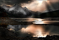
| 11/07/2007 10:45:25 PM | apocalyptic vision by ursulaComment: "The advantage of dodge/burn in a gray soft light layer is that the colours of the original do not change that way, whereas if you dodge/burn directly on the image, they do"
Not to mention that it's easy to undo/remove later.
Great job on this image. Absolutely stunning. | | Photographer found comment helpful. |
| 11/02/2007 06:30:59 PM | |
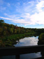
| 11/01/2007 10:28:07 PM | Mahoning Creekby Shea927Comment: Hi from the Critique Club,
I really like the colours in this image; the reds, yellows, and greens of the leaves fit well with the light blue in the sky. As well, the way you composed the river works well by providing oblique lines and allowing for a great reflection of the sky.
As was already mentioned, the trees could probably be brighter in this shot. Of course, the editing ruleset prevented you from lighting the trees without blowing out the sky even more.
Unfortunately, the first thing I noticed in this shot was the railing that blocks the bottom fifth of the image. It is distracting and really contrasts with the reflection in the water. I'd guess this image would have scored higher in the 5s had you composed the image without the rail.
Finally, there are some jpeg artifacts at the top of the trees. At first I thought they were simply unavoidable in such a busy image, but it appears you saved your image at only 50 kilobytes. You could have improved the image quality quite a bit up to the limit of 150 kb, and it's unfortunate that you didn't present this image at the maximum quality allowed for the challenge.
Overall, it's a nice shot of what I'm sure is a beautiful location.
Regards,
Geoff
Edit: spelling. Message edited by author 2007-11-02 02:29:10. | | Photographer found comment helpful. |
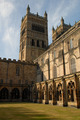
| 11/01/2007 10:11:53 PM | HIGH & DRYby eleanorComment: Hi from the Critique Club,
You've captured a beautiful building from a very interesting perspective. I like the composition, although it might have been better if the shadows and the top portion of the other tower weren't in the image. The image might have fared better with an increase in contrast, especially in the sky. For the future, a polarizer does a great job of deepening the blues in skies while maintaining very white clouds.
Alternatively, you could have taken a shot from almost right under the tower, looking up at it and capturing some of the texture of the building.
This is a good image, and a good first submission to DPC. Congratulations, and keep submitting!
Regards,
Geoff | | Photographer found comment helpful. |
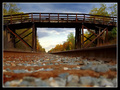
| 11/01/2007 07:49:22 PM | Country Milesby JawnyRicoComment: Hi from the Critique Club,
First of all, congratulations on finishing in the top 15. This is a great image that is well-suited to this particular challenge.
Throughout the image, the colours are excellent. Great contrast between the reds and greens and the yellows and blues. I happen to like the focus on the rocks in front of you; alternatively, you could have focused on the bridge and cropped out some of the tracks. The contrast in the sky is good, although an additional global increase in contrast wouldn't have hurt. The tracks do a good job of pulling the eye into the frame, and the "tunnel" under the bridge does a good job of keeping the eye there.
Overall, it's an interesting image with good composition, nice lines, and great colours. I can't think of much that would improve the image as it exists: perhaps a tighter crop with a person leaning on one of the vertical bridge supports, or even up on top of the bridge. It looks like the kind of place where senior portraits would be taken.
Regards,
Geoff | | Photographer found comment helpful. |
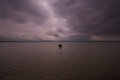
| 11/01/2007 07:29:46 PM | Alone in the riverby DirgeelucidatrComment: Hi from the Critique Club,
This is a nice find and a good time to break the rule of thirds (with the tree; it might have looked better with a bit less water). I like the darker mood (even if it was accidental), but would've liked to see more contrast in the sky. As well, this might have been a bit more emotional as a black and white image.
Overall, a pretty good score for this shot. You said you were unsatisfied with the level of light; perhaps you would've been happier with a re-shoot at an earlier time. A lower ISO would have given you more latitude during your adjustments.
Regards,
Geoff |
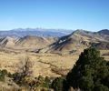
| 11/01/2007 07:18:43 PM | Far, far awayby NitinComment: Hi from the Critique Club,
You have good lines and composition here (good placement of the two trees and the horizon), with nice colour contrast between the blue sky and the yellows in the land. The landscape is nice, but there's nothing captivating or compelling in the shot. It might have been nice to get closer to that tree in the bottom left corner and make it a more integral part of the image.
A more interesting sky (sunrise, sunset, storm, etc.) would have been more engaging, which would have probably boosted your score quite a bit.
Overall, this image has good technicals but doesn't captivate me as a viewer.
Regards,
Geoff Message edited by author 2008-01-08 01:18:13. | | Photographer found comment helpful. |
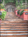
| 11/01/2007 06:45:21 PM | Worship Him From Afarby RosacalacaComment: Hi from the Critique Club,
My first thought when I saw this image was that it has great potential. The exposure is nice, and the perspective is good. I'd like to see the composition cropped a bit tighter, so that the black and white signs on the left and right are the stairs are cut out. By cutting out the archway on the right and the lights at the top, you'd create much stronger lines up to the statue.
Colours are nice in the image, but I'd recommend either increasing their saturation or eliminating colours almost to a black and white.
Most importantly, I think a strong boost in contrast would serve this image very well. The editing ruleset prevents you from selectively dodging and burning or vignetting the edges, but I think a simple curves adjustment layer would have boosted this image to a higher score.
Taking these points into consideration, along with some of the recommendations made in previous comments, I think you have a great image here that could be fixed up and printed. Good job.
Regards,
Geoff |
| 11/01/2007 02:57:10 PM | Zoomin'by CVetteComment: Hi from the Critique Club,
First of all, congratulations on your top 20 finish. This is a great capture of an interesting concept/perspective. The exposure is great, colours are very vibrant where they need to be, and the car is very sharp and in focus.
There isn't a lot to critique here. For one thing, it would be nice if the neon colours didn't bleed into the tire and the frame of the car near the passenger window. Of course, that's something that could be done outside of the challenge should you ever print the image.
That's about all I've got. Nice reflections, and great shutter length to get nice rotation of the mags. Well done, and very deserving of the score you got.
Regards,
Geoff | | Photographer found comment helpful. |
Home -
Challenges -
Community -
League -
Photos -
Cameras -
Lenses -
Learn -
Help -
Terms of Use -
Privacy -
Top ^
DPChallenge, and website content and design, Copyright © 2001-2025 Challenging Technologies, LLC.
All digital photo copyrights belong to the photographers and may not be used without permission.
Current Server Time: 04/07/2025 06:31:20 AM EDT.
|