| Image |
Comment |
| 05/05/2006 09:59:39 AM |
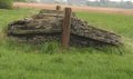
Sea of Grassby HXP101Comment: I don't know what that structure is but it sure looks like a boat. The long grass really looks like water being pushed aside too. Nice job. There are some unfortunate background elements. A little more color saturation may have aded too. Nice image though. |
| 05/05/2006 09:55:54 AM |
|
 Photographer found comment helpful. Photographer found comment helpful. |
| 05/05/2006 09:52:37 AM |
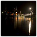
Like ships in the nightby TimComment: I like the positioning of the boat at the top and the use of space at the bottom. The light and reflection on the right is a little overpowering, IMO. |
| Photographer found comment helpful. |
| 05/05/2006 09:50:07 AM |
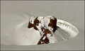
Shining like a black mans ass in a snow bankby IceRockComment: Gutsy "saying" in our PC world.
I would have prefered the snow to be a little brighter (considering the implied contrast of the saying), but know that snow is hard to keep some texture but keep bright white. While the swirl of the ridge helps, it is a little too centered IMO. |
| 05/05/2006 09:45:20 AM |
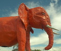
PINK ELEPHANTby CONRADComment: That's one big elephant. I saw a Discovery Channel show about a similar elephant (in New Jersey?) that had to be moved. I wondered if it might be the same one. Anyway, I looked at it on two monitors and it looks a little more orange than pink to me, but I'll give you benefit of the doubt. A bigger issue for me is the trees in the background; a little distracting. |
| 05/05/2006 09:39:44 AM |
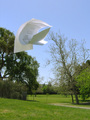
Three Sheets to the Windby GeneralEComment: I like the idea. The background is distracting. Also, I wonder if some more separation between the sheets would have been more dramatic (but maybe impossible to catch). I like the inclusion of writing on the sheets of paper because it quickly identifies them as sheets of paper. |
| Photographer found comment helpful. |
| 05/02/2006 11:16:21 AM |
Protecting the Castleby MarjoComment: I like the idea behind the picture. DOF and/or focus seems to be a problem though. Details in the flowers and shield are lost. |
| Photographer found comment helpful. |
| 05/02/2006 11:13:52 AM |
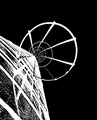
Siloby rioloboComment: Interesting perspective. Post processing is a little much for me. It looks like "line art" rather than a negative. |
| 05/02/2006 11:10:21 AM |
|
| 05/02/2006 11:09:14 AM |
what...by eggfoxComment: This doesn't appear to be a negative in the sense that the challenge seems to be intended. |
| Photographer found comment helpful. |
Home -
Challenges -
Community -
League -
Photos -
Cameras -
Lenses -
Learn -
Help -
Terms of Use -
Privacy -
Top ^
DPChallenge, and website content and design, Copyright © 2001-2025 Challenging Technologies, LLC.
All digital photo copyrights belong to the photographers and may not be used without permission.
Current Server Time: 04/12/2025 11:08:24 AM EDT.