| Image |
Comment |
| 12/07/2006 08:36:31 AM |
A Beautiful Deathby marboComment: This is a beautiful image but I'm afraid it might be getting hammered by voters in the particular challenge. It's a technical masterpiece and impeccibly processed. I really like your idea, "A Beautiful Death." It may have been hard with this particular image, but for the sake of really nailing the challenge, it would have been nice to offer some sort of contrasting element within, so that even if I couldn't see the title, I'd understand what was trying to be conveyed. But very well done! 7. 8o) |
 Photographer found comment helpful. Photographer found comment helpful. |
| 12/07/2006 08:32:05 AM |
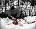
red handedby tiby_dicuComment: Well that's death alright! I don't really have a problem with gruesome images, but this one is having a lot of trouble technically. I can't find a single sharp point in it and the selective desaturation doesn't seem to convey anything a full black and white or full color image wouldn't, except for the emphasis on blood maybe. But the eye will go there anyway. Double check focus and shutter speed. |
| 12/07/2006 08:27:07 AM |
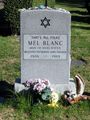
That's All Folks!by moviealienComment: A grave stone does work for the challenge and the message is quite amusing, but I feel like there may have been some more interesting ways to capture this image. Perhaps some dramatic lighting, early in the morning or late in the afternoon; maybe black and white would have worked better. Also think about angle when you're shooting a static and relatively mundane subject. Like if you shot from really low to the ground, you might have been able to get some decerning billowy clouds or sometihng to spark that mood a bit more. Of course these are just some ideas. The concept works I think, just think about looking at in from all different angles and modes of lighting and consider the meaning of everything that appears in the frame. 8o) |
| 12/07/2006 08:21:17 AM |
Who pays the ferrymanby fredandaudComment: What I like: the wonderful textured, gradient from black to white. That does a wonderful job drawing my eye right to the subject and beyond into his infinite future. Buuuttt... the subject feels less sharp than he ought to be. There is also very little detail in the shadows. Not a serious downfall given the type of image, high-contrast works, but I just feel like there could be a bit more technical clarity. It doesn't give me an immidiate sence of death, but I guess that just gives me a chance to read into it more. Well done overall! 8o) |
| Photographer found comment helpful. |
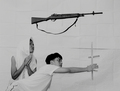
| 12/07/2006 08:16:20 AM |
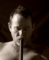
Despairby NstiG8trComment: I took a bit of studying, but I finally realized that the subject has the barral of a gun in his mouth. It was slightly difficult to tell at first, but given the title and challenge, it became apparent. But the lighting is quite nice and the black background sets the mood well. It's still a bit hard for me, as a viewer, to connect with the subject and really feel what the subject feels though. Seems more emotion/angst in the subject's face would really drive the point home. But it's definitely a well done image! 8o) |
| Photographer found comment helpful. |
| 12/07/2006 08:10:38 AM |
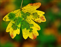
The Kiss of Winter ~ a bud never to bloomby mangymooseComment: I like that you've tried to do something different and unique and the concept is interesting. But perhaps more emphasis on the ice, or just more ice in general, and less sunshine would have really driven the "death" point home. Might also help to really single out the flower from the others and from the background. Nice image though. 8o) |
| Photographer found comment helpful. |
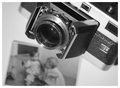
| 11/22/2006 10:34:30 AM |
The Perfect Coaster is Born - 1982by tatemaeComment: Did CDs really come out in '82? Who knew!? Very cool shot! The microphone troubles me for some reason; I guess I'm still not totally sure why it fits here. But the composition is quite nice regardless! 8o) |
| 11/22/2006 10:31:56 AM |
my father´s treasure in 1960by sigrun_thComment: This is a very clean and simple image, definitely a photographers photograph. Not because of the camera, more because every element serves a purpose. There is no wasted space in this image and it is quite compelling to me. Well done! 8o) |
| Photographer found comment helpful. |
| 11/22/2006 10:29:28 AM |
|
| Photographer found comment helpful. |
| 11/22/2006 10:25:53 AM |
|
Home -
Challenges -
Community -
League -
Photos -
Cameras -
Lenses -
Learn -
Help -
Terms of Use -
Privacy -
Top ^
DPChallenge, and website content and design, Copyright © 2001-2025 Challenging Technologies, LLC.
All digital photo copyrights belong to the photographers and may not be used without permission.
Current Server Time: 04/18/2025 12:13:05 PM EDT.