| Image |
Comment |
| 05/17/2006 02:17:32 PM |
|
 Photographer found comment helpful. Photographer found comment helpful. |
| 05/17/2006 02:17:01 PM |
Conceptionby JunieMoonComment: Nice new take on the light defraction effect that seems to be done alot. I like it. Suggestions: Crop out the support stem at the bottom, center the bottom block on the support, and the substances on the bottom of the egg and the flaws in the glass objects are a bit distracting. |
| 05/17/2006 02:10:56 PM |
Majesticby steffyldComment: The image looks a little hot (direct flashish) I'd suggest using a defuser of some sort on the flash, multiple flashes if you can or, in the case of an on-camera flash (depending on the camera you have), a piece of printer paper in front of the flash to defuse it. A defuser(s) will provide a softer light and bring out more tones. Good framing. |
| Photographer found comment helpful. |
| 05/17/2006 01:01:22 PM |
|
| 05/02/2006 09:18:57 PM |
|
| 05/02/2006 12:04:20 PM |
|
| Photographer found comment helpful. |
| 04/26/2006 12:51:05 PM |
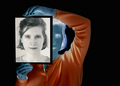
Checkersby ColeyComment: Grate use of Negative and Positive and thinking "negatively" as you shoot. |
| Photographer found comment helpful. |
| 04/26/2006 11:40:10 AM |
Two Facedby bvoiComment: VERY VERY CREATIVE. Great way to think negatively (in a good way). |
| Photographer found comment helpful. |
| 04/18/2006 09:06:20 PM |
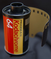
Old Friendby red_geckoComment: Post Voting: Thanks for all the votes and positive remarks. The image did better than I expected.
Some Explanations: First a lot of credit goes to my wife. It was her idea - I was thinking of other ways to express chrome and she came up with this idea. As for color - I intentionally kept the colors in the red/yellow ranges to express the way that a Kodochrome would look. As for focus - I kept the "koda" part in focus to hi-light that and the "64" instead of the "chrome" which was the focus of the challange.
Thanks again for all the comments - It truly is a missed friend. I'd use it still if Digital hadn't caught up with film in clarity. |
| 04/04/2006 10:08:32 AM |
Do not disturb... by blancericComment: Great shot. Looked like sand dunes and grass in the thumbnail size. Focus is in just the right spot. |
| Photographer found comment helpful. |
Home -
Challenges -
Community -
League -
Photos -
Cameras -
Lenses -
Learn -
Help -
Terms of Use -
Privacy -
Top ^
DPChallenge, and website content and design, Copyright © 2001-2025 Challenging Technologies, LLC.
All digital photo copyrights belong to the photographers and may not be used without permission.
Current Server Time: 04/07/2025 06:18:39 AM EDT.