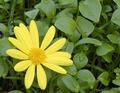
Green worldby
kevinswopeComment: Joshua, greetings from the Critique Club. It is really a priviledge for me to critique your image. Hopefully both of us can learn through your image.
The concept here is good. I think it fits the topic well. I see a few things that might have helped a little. First off is the image looks a little flat. Getting more contrast into the photo would help the main subject "pop" a little more and give it an even more "out of place" feel.
The other issue I see here is the lack of detail in the flower. I believe a few moves in Photoshop and the flower would probably just jump out and bite you... Well a picture is worth a thousand words so (hope you don't mind)...
//www.gammadesignstudios.com/fd.jpg I think the change is dramatic.
The only other thing I could mention is the comp of the photo. The flower is a little too close to the edge. This is called a "pressure point" in photography. A little bit further back off the edge would help releave some of the tension.
This sound like a lot of stuff, but it really isn't. The processing work took minutes in PS. Over all this is a good image. Your score shows it. I consider anything above a 5 a good score. It is a great idea and brings thoughts of summer to my mind, which right now (10 degrees outside) I could use...
If you have any questions email me. I would be happy to elaborate more. I hope this has helped a little...
Dave Nitsche
Message edited by author 2003-01-14 11:06:49.