| Image |
Comment |
| 02/17/2003 07:38:59 AM |
Round by albright1Comment: Tough shot to shoot. You did an incredible job... Dave |
 Photographer found comment helpful. Photographer found comment helpful. |
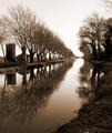
| 02/17/2003 07:37:55 AM |
|
| 02/10/2003 05:43:11 AM |
Self Portraitby jjbeguinComment: This is a pure work of art and deserves to be in the top 3. Who ever gave this a 1 or a 2 I suggest you just put the camera down because you just don't get it. Great job and congrats... |
| 02/10/2003 12:16:00 AM |
Two Classics by JackoComment: Incredible image. One of the two 10's I have ever given here. How anyone could rate this a 2 or a 3 obviously doesn't have a clue what cliche means. LOL. Every week we are guaranteed 3 or 4 chess board shots here and water drop shots are a dime a dozen. Great image. You are one of my favorites here, that's for sure... Dave |
| Photographer found comment helpful. |
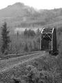
| 01/22/2003 10:42:10 AM |
Crossing by timj351Comment: Who ever gave this image a 1,2 or 3 should be revoked from photography. They should never grab a camera, because if they think this is bad they will never take a good image, ever!!!! This is a stunning example of landscape imagery taken by (IMO) the best photographer on this site.
Congrats Tim. I still think the should be first place....
Dave |
| Photographer found comment helpful. |
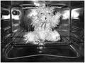
| 01/15/2003 10:12:10 AM |
For an instant Smokey the Bear, cook at 450F :o)by kosmikkreeperComment: Yanik, greetings from the Critic Club!!! Hey, nice image. Made me laugh, so on that you got a 5 from me to start with. I see a couple things that can be improved a little on. The first is that the image needs to be straightened. It is running a little up hill. With so many horizontal elements perspective is real important to keep the viewer balanced. It is the first thing I check in all my images. Another thing I notice is that the image is a little harsh looking. I think it is generated by the burning high lights. Shooting shots like this are hard because you aren't in a controled environment. I am sure the harsh affects in the oven are generated by windows behind you. Maybe next time get a big dark blanket and hang it up behind you to block external light. I have done that many a time. The mid tones (middle grey tones) are not really represented here and also lend to a harsh affect.
I think I would be remiss if I didn't mention the things I like about this image. I love the looks of the heat elements the grey tone gives me the feeling they are turned on. I love the splatter in the back of the oven. I also love the humor in it and appreciate it greatly. And lastly I love the subject. Looks psycho and that works here.
Overall you have a great concept here and a good image. Hard shot to pull off but I think you did admirably. A few tweeks here and there would help...
If you have any comments or questions about this please don't hesitate to email me.
Dave Nitsche |
| Photographer found comment helpful. |
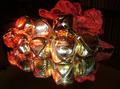
| 01/14/2003 08:57:38 AM |
Jingle Bellsby GekkerComment: Carrey, greatings from the Critique Club.
Wow did you pick a hard one!!! I have personal experience with shooting bells. Yuck. They are bright shiney metallic globes of death in my eyes. I had all bells removed from my house after the shoot. LOL.
If you want to use bright shiney bells use indirect lighting and never use flash. I had to take 10 quartz lamps (with diffusers) and face them away from the subject and bounce the light back at the subject. It still was a glare nightmare.
I would also suggest to remove the mirror. Mirrors refract glare many times making the reflection look out of focus which is what you have going on here.
I didn't get a chance to vote on your image. I think your score on this is a bit low with all the stuff you probably had to go through to get it. It is a nice try with a very unforgiving subject. Next time borrow ever neighbors house lights and bounce that light at the subject. Might help a bunch. And give yourself a chance and don't use a mirror!!!
If you have any comments or questions about this email me, I would love to hear from ya...
Dave Nitsche |
| Photographer found comment helpful. |
| 01/14/2003 08:44:24 AM |
Silent All These Years - Tori Amosby paynekjComment: Kevin, greeting from the critique club.
You picked a strong impactful song title. Hard to pull off though. I get the silent part, but what is indicating a period of time? I asked this question about a bunch of images this week. One part would be represented but the other wouldn't.
I like the highlights in the eyes and the half and half lighting on the face and the converse lighting theme on the background wall. I don't like the wallpaper in this shot. I think a white BG might have made the subject stand out better. A few too many dark tones present. A white BG might have made the subject pop.
The last thing I might suggest is some sort of a facial expression. Being uncomfortably silent would suggest some pent up rage, so maybe and expression of wanting to break out? Just a thought.
Nice try. Tough image to attempt. If you have any comments or questions drop me a line. I would be happy to hear from you...
Dave Nitsche |
| Photographer found comment helpful. |
| 01/14/2003 08:30:43 AM |
Auld Lang Syneby kenboComment: Hi Kenbo, greetings from the Critique Club!!! There are a few comments that come to mind on this shot.
The first is perspective. The image is crooked. You might have meant to do it, but it won't work with all the horizontal and vertical lines you have present.
The second is noise. Since this is a night shot there is a lot of noise present. Sometimes there is nothing a shooter can do about it. In my case with my D-30 higher ISO shots incur noise. So when I run into those situations I have two choices. To shoot or not to. Most of the time I choose not to becaue noise ruins shots in my opinion.
The third is subject. I am not really sure of the subject of this image. I think it is the lighted tree reflection but which one? My eye goes to the one that is blown out and that is not the kind of feature you want a viewers eye to go to.
I have to give you credit. You picked one heck of a song to try and shoot. I couldn't have done it. I can't think of a real good image that could represent that song. Keep shooting. Experience makes everyone better. Listen to a lot of the people here. They are very good at this stuff.
If you have any comments or questions about this critique please email me... Thanks
Dave Nitsche |
| 01/14/2003 08:19:25 AM |
Digital Worldby arnitComment: Arnit, greatings from the Critique Club! I did not vote on any of these images in this challenge and have not read any comments. So this is my first time seeing this and wow, this is a nice image. There are only a few comments I can make, and they will be small comments for sure. I might open up the DOF a little bit more. Even though I can read digital world, I would like it a bit sharper. I think if the type were sharp and the film canister blurry the symbolism might have been more impactful, especially if the canister were further back in the frame.
The shadows along with the blurred type in the image are turning blue. I took it into photoshop to verify that it wasn't my monitor and it is blue heavy. It has the chromatic abbrasion feel to it. Easily enough fixed though.
I wish I could supply you with better feedback, but I really like the image. The blown out background is nicely done. The idea is powerful. The green and red in the cannister stand out nicely. Great image...
If you have any questions or comments for me, just email...
Dave Nitsche Message edited by author 2003-01-14 13:21:18. |
Home -
Challenges -
Community -
League -
Photos -
Cameras -
Lenses -
Learn -
Help -
Terms of Use -
Privacy -
Top ^
DPChallenge, and website content and design, Copyright © 2001-2025 Challenging Technologies, LLC.
All digital photo copyrights belong to the photographers and may not be used without permission.
Current Server Time: 04/09/2025 07:57:59 AM EDT.