| Image |
Comment |
| 07/25/2009 03:44:36 PM |
Peacockby JoaniePComment: A very interesting concept. However, for a shot like this to work, one needs really edgy lighting. |
| 07/25/2009 03:42:51 PM |
Sarahby jasonlpriceComment: Too much clutter around this one for me. It's a lovely shot of her, but the background and her surrounds could use some work. |
 Photographer found comment helpful. Photographer found comment helpful. |
| 07/24/2009 07:02:38 AM |
A sharp characterby cogeroxComment: This is a great idea, but could really have benefited from some more interesting light. |
| Photographer found comment helpful. |
| 07/24/2009 07:02:10 AM |
Tiredby jcarComment: You exposure is really letting you down here. I'm not thrilled with the way you tried to cover it up, either. |
| Photographer found comment helpful. |
| 07/24/2009 07:01:03 AM |
Maryby boyd2000Comment: You have a lovely model, and a wonderful depth of field. However, she's not in focus, and the saturation here is much to high for my taste. |
| Photographer found comment helpful. |
| 07/24/2009 07:00:18 AM |
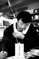
Busyby power47Comment: I appreciate your idea here, but in a challenge called 'portrait' I would expect something a little more set up, and a little less candid. Perhaps this was set up, but it feels to cluttered and random to be a good stock style portrait. |
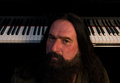
| 07/24/2009 06:59:03 AM |
Unshavenby vladoComment: I wish something was in focus completely here. Your title is unshaven, but even his beard is out of focus. The contrast is a little too much for what you were trying to convey, and the background blends into him. |
| Photographer found comment helpful. |
| 07/24/2009 06:57:33 AM |
the lookby ConnorComment: This image is not scoring well from me for a couple of reasons. The first is that there are two many blacks blending into one another. The second is that the focus is well off. You have a nice idea, a nice model, and a good pose, and this image could have been much better. |
| 07/23/2009 07:37:22 AM |
The Blacksmithby GringoComment: This is a fantastic location, wonderful toning, and perfect light. If only it were a tad sharper, this would be my pick for the challenge! |
| Photographer found comment helpful. |
| 07/23/2009 07:36:43 AM |
Vittorioby IvoComment: The border here makes me feel like I'm looking through a viewfinder. Your editing really brings out the details in his face, but I feel like you've lost something of the original lighting because of it. |
| Photographer found comment helpful. |
Home -
Challenges -
Community -
League -
Photos -
Cameras -
Lenses -
Learn -
Help -
Terms of Use -
Privacy -
Top ^
DPChallenge, and website content and design, Copyright © 2001-2025 Challenging Technologies, LLC.
All digital photo copyrights belong to the photographers and may not be used without permission.
Current Server Time: 04/07/2025 06:12:26 AM EDT.