| Image |
Comment |
| 07/06/2006 09:24:12 AM |
Jazzby idnicComment: This is an amazing self-portrait. The pose really makes it. |
 Photographer found comment helpful. Photographer found comment helpful. |
| 07/04/2006 09:17:26 AM |
Helloby BradComment: Damn, that is ugly...
Great shot though :) |
| Photographer found comment helpful. |
| 07/02/2006 11:53:49 AM |
beatles outtakeby Jaded_HousewifeComment: It looks like "her" back has been broken.
Time to go back to school for some spelling lessons :DMessage edited by author 2006-07-02 15:55:30. |
| Photographer found comment helpful. |
| 07/01/2006 02:18:41 PM |
|
| 07/01/2006 02:16:34 PM |
JulyGolf 098abordsm.jpgby Patents4uComment: Nice sunset. My only gripe is that you've got the horizon pretty much dead centered in the frame. I would crop so that horizon is at the bottom thirds line. |
| Photographer found comment helpful. |
| 07/01/2006 02:12:26 PM |
sunlight.JPGby qbicleComment: The noise can be cleaned up with noise reduction software. An agressive curves adjustment will increase the contrast for you (s-curve). You might also want to take the forground into silloutte. I would clone the church spire out. You can also play with Hue/Saturation and maybe Colour Balance adjustment layers to give the colout more impact. |
| 07/01/2006 02:06:15 PM |
clownfish271.jpgby flip89Comment: A nice shot, but extremely noise. You should try to clean it up with Neat Image or the like. I would get rid of the little spot in front of the fish's mouth, it just bugs me. |
| 06/29/2006 08:43:31 AM |
Flowby MadMan2kComment: That looks awesome. Looks more like a painting than a photograph. |
| Photographer found comment helpful. |
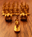
| 06/28/2006 03:54:19 AM |
Risky Businessby angelfireComment: If this was shot on a lower ISO the bokeh would be much better in my opinion. The graniness takes away from the smooth look that makes bokeh appealing. You could also try some noise reduction on it. The background would also have been blurred out more if you put the back figures further back and then shot from a lower angle (to still get them in the frame). As it stands their is too much definition in the background. |
| Photographer found comment helpful. |
| 06/26/2006 05:17:15 AM |
|
| Photographer found comment helpful. |
Home -
Challenges -
Community -
League -
Photos -
Cameras -
Lenses -
Learn -
Help -
Terms of Use -
Privacy -
Top ^
DPChallenge, and website content and design, Copyright © 2001-2025 Challenging Technologies, LLC.
All digital photo copyrights belong to the photographers and may not be used without permission.
Current Server Time: 04/07/2025 06:27:04 AM EDT.