| Image |
Comment |
| 05/31/2006 07:03:07 PM |
:)by facesastheycomeComment: the focusing on this image just doesn't work for me, the depth of field is off. my eyes are fighting to find a main point of interest. i like the colors though |
 Photographer found comment helpful. Photographer found comment helpful. |
| 05/31/2006 07:02:12 PM |
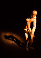
Woody Presleyby tngrndreamComment: Do you notice the "ghosting" between the shadows/highlights on the actual wooden figure? i am not for sure as to what caused this, perhaps over contrast, i would have loved to see more emphasis on the actual shadow and less on the figure. my eyes are drawn more to the shadow, and i find it more visually intreguing. 7 |
| Photographer found comment helpful. |
| 05/31/2006 07:00:20 PM |
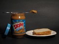
Late Night Snackby BobComment: i understand that this image fits the competition, however it lacks great creativity. the overal image is rather dull and has little visual interest. next time try a couple different things, such as:
a close up of the peanut butter being spread on the bread
the actual peanut butter jar inbetween the slices of bread
be creative, it is to your advantage
-4 |
| 05/31/2006 06:58:21 PM |
|
| Photographer found comment helpful. |
| 05/31/2006 06:57:53 PM |
Blue Ducks Marchingby LimboComment: this image just doesn't work for me. the ducks are obviously not blue and the misrepresentation of color is unnessary. in the future, i would recomend having left the ducks their common yellow, and implimented a blue background, the contrast of colors would have worked wonderfully. 5 |
| Photographer found comment helpful. |
| 05/31/2006 06:56:16 PM |
Haunted Waterby bloodredblack242Comment: love the idea, but you blasted this photo with too much contrast. furthermore, the light swirl in the top right corner (the largest line) is distracting to the composition. 7 |
| Photographer found comment helpful. |
| 05/31/2006 06:55:27 PM |
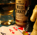
boys night outby ratzComment: you lost this image when you neglected to set your white ballance appropriately. that could have been fixed in post, by adjusting your curves and setting the white point as a white point on the cards. the composition is a little busy, the chess pieces could have been eliminated and replaced with poker chips. chips wouldn't have filled the frame as tightly and would have been less distracting. the white "knight" is very distracting. barely holding onto a 6 |
| Photographer found comment helpful. |
| 05/31/2006 06:52:47 PM |
Seashellby susanhComment: This is a stellar photo, although I think a square crop could have added to the picture. Possibly a little too much contrast, but not that big of a deal. An easy 9 |
| Photographer found comment helpful. |
| 05/31/2006 06:51:37 PM |
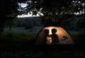
First Campoutby glad2badadComment: cute shot, although i kind of wish it was darker outside. even a sunset would have been nice, not complete darkness. I like how it isn't just the child's shadow, but also the shadow of a parent (assumedly mother). Well done. 8 |
| Photographer found comment helpful. |
| 05/29/2006 03:01:35 PM |
|
| Photographer found comment helpful. |
Home -
Challenges -
Community -
League -
Photos -
Cameras -
Lenses -
Learn -
Help -
Terms of Use -
Privacy -
Top ^
DPChallenge, and website content and design, Copyright © 2001-2025 Challenging Technologies, LLC.
All digital photo copyrights belong to the photographers and may not be used without permission.
Current Server Time: 04/07/2025 06:08:42 AM EDT.