|
|
|
Showing 101 - 110 of ~252 |
| Image |
Comment |
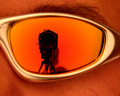
| 08/20/2006 03:02:10 AM | Happy Snappyby redmoonComment: one of my favcourites this challenge. just to nitpick, it's a bit overexposed on the camera body |
| 08/20/2006 03:01:33 AM | Look it's me your 350D!by bigjComment: nice. sharp image, and i like the fisheye effect (or you got one hugeass lens on the end of your camera :P |  Photographer found comment helpful. Photographer found comment helpful. |
| 08/20/2006 03:00:59 AM | Say Cheeseby Blue_Moon_CatComment: haha awesome idea. just wish a little more of him was in focus, otherwise excellent idea | | Photographer found comment helpful. |
| 08/20/2006 03:00:32 AM | I choose to take this photo Nowby owenComment: I can see mirrors were involved... but i really want to see how you did this one :)
technically, i just wish the camera was a little sharper... and i think its time to blow out the dust :P | | Photographer found comment helpful. |
| 08/20/2006 02:59:51 AM | | | Photographer found comment helpful. |
| 08/20/2006 02:58:59 AM | | | Photographer found comment helpful. |
| 08/20/2006 02:58:37 AM | Rising Sunby lambie83Comment: photo is too small, and i'd have preferrd to see whole camera. also obvious you used a mirror | | Photographer found comment helpful. |
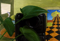
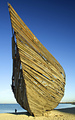
| 08/18/2006 04:08:37 AM | Final Resting Harbour of Yesterday's Transportby diablo2097Comment: Since i can't figure out how to edit my initial comments, i'd really like to say thanks to everyone who gave me a vote, and it's my best finish by far, and i'm very happy :)
initially i wanted to remove the guy and other distracting elements, but in a way i guess its lucky it was a basic editing challenge, and now i know that the dude might be something to keep for a final version. |
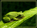
| 08/08/2006 05:30:46 AM | RRRRRibbit!by mimsydotesComment: Critique Club
Composition
Excellent composition, placing of the frog is perfect. i really like the contrasting shadows and light, but the only thing is i'd have really liked to get rid of the shadow covering the backside of the frog. Also, i like the leading lines of the leaf. The texture of the frog shows up really nicely.
Technical
DOF is good, but the back of the leaf is a bit oof in a distracting way, not najorly, but just a little. Lighting is great, bringing out frog texture. Picture is overall technically quite nice.
Post processing
Firstly, i have to say... the DPC size limit is 640!!! please use all 640 pixels, as I think you would have lost a lot of votes because of this. Love the colours, you've got those down really nice. Personally i used to like borders, but i'm not sure if this would be better with or without. Personal taste i guess. In terms of sharpening, i'm not sure if you went a teensy bit overboard on the frog, as he's looking a little bit pixelated near his head, but thats just nit picking.
Hope this helped, and i think the biggest 2 things to improve shot would be, a) bigger photo, b) no shadow on frog's butt.
Enjoy, and feel free to pm me
|
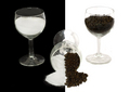
| 08/01/2006 11:17:15 PM | Salt n Pepper Comboby diablo2097Comment: thanks for all the comments guys, especially the one about sea salt crystals... i was too busy thinking how to use something other than pepper thats smaller to match the salt, but didn't think of using rock salt instead and keeping the pepper :(
Ah well, my best finish so far, and hopefully there'll be better finishes to come :) |
|
Showing 101 - 110 of ~252 |
Home -
Challenges -
Community -
League -
Photos -
Cameras -
Lenses -
Learn -
Help -
Terms of Use -
Privacy -
Top ^
DPChallenge, and website content and design, Copyright © 2001-2025 Challenging Technologies, LLC.
All digital photo copyrights belong to the photographers and may not be used without permission.
Current Server Time: 04/07/2025 06:28:00 AM EDT.
|