| Image |
Comment |
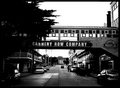
| 01/22/2006 06:57:02 AM |
Cannery Rowby kmbr2001Comment: Too much contrast I think - too much detail lost in the shadows, and the sky is blown out to the point of featurelessness. If it was a cloudless day, then blowing the sky out would at least not highlight that any more, but to lose so much shadow detail lets down the picture. Maybe if you'd gone into the curves and adjusted the greypoint to bring out some shadow detail, this could have been improved. |
 Photographer found comment helpful. Photographer found comment helpful. |
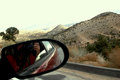
| 01/22/2006 02:28:33 AM |
me in the mirrorby maryaresComment: Interesting idea, but way too much contrast, the blown-out highlights and lack of details in the shadows (particularly around you and your camera) don't make it work very well. Ditto the scenery which is not the most exciting or colourful - you could probably have picked a better location. The idea has merit, but the exectution doesn't live up to it. |
| 01/21/2006 04:15:14 PM |
|
| Photographer found comment helpful. |
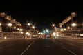
| 01/21/2006 04:06:06 PM |
Historicby M.O.C.Comment: Seems very flat, nothing really catching interest in the image. |
| Photographer found comment helpful. |
| 01/21/2006 04:00:06 PM |
Old faithfuls road to salvationby hutch699Comment: I'm a fan of negative space and not afraid of having completely black sections in photos, but I think you have a bit too much here. I think cropping some of the right, and letting the chain intrude into the negative space could enhance the image. Also, the focus seems a bit off or soft. |
| Photographer found comment helpful. |
| 01/21/2006 03:56:13 PM |
|
| 01/21/2006 03:55:19 PM |
the Road over your shoulderby fstopopenComment: I have a broad definition of what meets the challenge, but frankly I think this one DNMC. It's a portrait of a woman, which you've taken in such a way that there is a road in the background - but the road does nothing to enhance the photo; in fact, if anything it detracts, and more importantly has forced you into positioning such that the lighting on the woman is unflattering. Trying to shoehorn this into the Road challenge has let down both yourself and the model. |
| Photographer found comment helpful. |
| 01/21/2006 03:41:16 PM |
Road to Recoveryby justpeachy742Comment: Interesting take on the subject, well-executed, and I can understand the underlying feelings. I hope it doesn't get slammed by the literalists. |
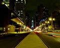
| 01/21/2006 03:29:20 PM |
Up Broadby banmornComment: Very little differentiation between the sky and the buildings, so you get the "lights (and other things) hanging in the air" effect which isn't great - top left corner is the worst offender. Generally seems a little underexposed - perhaps adjusting the greypoint in levels to bring out some of the shadow detail without blowing out the bright lights further would have helped. |
| Photographer found comment helpful. |
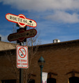
| 01/21/2006 03:24:52 PM |
Road?by jaka_gledegComment: Interesting shot... leaving the bike in there for scale definitely increases the impact. |
| Photographer found comment helpful. |
Home -
Challenges -
Community -
League -
Photos -
Cameras -
Lenses -
Learn -
Help -
Terms of Use -
Privacy -
Top ^
DPChallenge, and website content and design, Copyright © 2001-2025 Challenging Technologies, LLC.
All digital photo copyrights belong to the photographers and may not be used without permission.
Current Server Time: 04/07/2025 06:11:32 AM EDT.