| Image |
Comment |
| 06/24/2006 06:30:20 PM |
30 seconds of IKEA sunriseby Haukur JoComment: Sorry, this does nothing for me, even as an abstract. The flared light and blown highlights at the right dominate the photo, nothing is sharp but the out-of-focus aspect doesn't look deliberate, there are lots of messy reflections or artifacts, particularly on the left object. |
 Photographer found comment helpful. Photographer found comment helpful. |
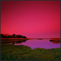
| 06/22/2006 06:30:37 AM |
red skies at nightby RikkiComment: Interesting idea, but I think you've manipulated it too much. I can see banding in the sky colours, particularly toward the top left corner. The red in the centre of the frame is a bit too overpowering. |
| Photographer found comment helpful. |
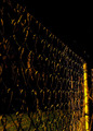
| 06/22/2006 06:28:44 AM |
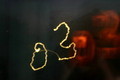
Fencing at Nightby TG73Comment: Too dark, needs longer exposure or wider aperture or a slightly different angle to bring out some more detail in the fence. |
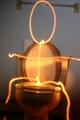
| 06/22/2006 06:27:15 AM |
On the Canby danthesquidkidComment: Entertaining idea, but the technicals are a real problem - horribly out of focus, tilt that looks like a mistake rather than deliberate, and mediocre central flaming. Fixing the focus and adjusting the framing to something a bit more interesting (e.g. move the toilet a bit to one side, and include the figure reaching for the toilet paper?) would not make it a ribbon winner, but would make a huge improvement. |
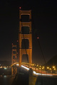
| 06/21/2006 06:56:59 PM |
Golden Gateby pelfComment: Composition/framing is ok, but the bridge seems a bit hazy - could be motion blur I guess. Overall it's a bit dark, I think I'd like this more if the sky was a bit lighter - dark/midnight blue rather than grey/black? |
| 06/21/2006 06:52:33 PM |
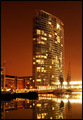
1, West India Quayby redmoonComment: This feels overexposed to me - the bright lights at the bottom flaring too much, and the sky feels too bright-orange, a bit off-putting. It could be improved if you were able to find an angle that included the building (or most of it) but excluded the cranes. |
| Photographer found comment helpful. |
| 06/21/2006 06:50:50 PM |
Wrong 30by litsaComment: The rest of the image is just too murky for me. It would be better if the background was really dark/black, or if it had a bit of colour in it - but as it is, it's a dull featureless grey that looks very pixellated, and that's distracting. |
| 06/21/2006 06:49:08 PM |
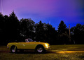
MG at Nightby EricMGB1974Comment: Interesting idea, but all the wiggly lines - particularly the ones in forefround on the car tire and door, but also the cumulative impact of all of them together - become way too distracting and ruin what could otherwise have been a pleasing image. |
| Photographer found comment helpful. |
| 06/21/2006 06:47:12 PM |
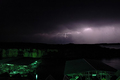
Lightening By The Lakeby shadeeuaComment: I think you've gone too wide here, so there is more attention on the buildings (boat yards? at first I thought they were cars being stripped!) and less on the lightning, with the landscape becoming black and featureless. I'd suggest zooming in further, and allowing the landscape to be exposured a little more strongly to add some feature. |
| 06/21/2006 06:44:57 PM |
It's in the P-Iby Hawk5000Comment: Sorry, this doesn't do much for me. The highlights are too blown out with the shadows too dark, and there composition is pretty plan. Looks like a 30-second grab shot. |
| Photographer found comment helpful. |
Home -
Challenges -
Community -
League -
Photos -
Cameras -
Lenses -
Learn -
Help -
Terms of Use -
Privacy -
Top ^
DPChallenge, and website content and design, Copyright © 2001-2025 Challenging Technologies, LLC.
All digital photo copyrights belong to the photographers and may not be used without permission.
Current Server Time: 04/07/2025 06:19:23 AM EDT.