| Image |
Comment |
| 05/16/2006 06:45:27 PM |
|
| 05/16/2006 06:31:34 PM |
|
 Photographer found comment helpful. Photographer found comment helpful. |
| 05/07/2006 05:28:51 AM |
frisky cocktail...by IreneMComment: This is a comment from the Critique Club;
What do I like about this image;
-Almost everything - nice composition, nice colours, nice background - Shit - great image (excuse the french)
What I would've changed;
-Seems a bit dark. Specially the umbrella
-The splash almst seems pasted if you know what I mean. Maybe it would've been a goot idea to leave the splash out.
Anyway - GREAT SHOT. I see in your portfolio that you like splash and water shots. Some impressive work there. |
| Photographer found comment helpful. |
| 05/07/2006 05:21:27 AM |
Mr. Whiteby maddyyComment: This is a comment from the Critique Club;
What do I like about this image;
-Nice composition
-Very nice idea.
What I would've changed;
-I would've made the original a bit lighter and then change to negative. This would've created a "darker" negative image.
-The details is lost (most likely a combination of exposure and Sharpness)
-Bump up the Sharpness a bit to bring out more detail.
|
| 05/07/2006 05:15:57 AM |
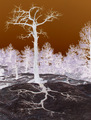
Negative Reflextionby lectrolComment: This is a comment from the Critique Club;
What do I like about this shot;
-Great idea with the "shadow". Makes it very interesting.
-Saw that some people didn't like the brown sky - IMHO, I like it. Nice contrast with the tree.
What I would've changed;
-The trees in the background is distracting. Maybe a bit more DOF would've worked well here.
-Bump up the sharpness on the tree and shadow a bit. This will also help to create depth in the image.
Great image and surely deserving to be amaongst your top 4 challenge entries. |
| 05/07/2006 05:09:42 AM |
Red Light Green Lightby LindaocComment: Comment from the Critique Club;
Not much I can say (in my limited experience). VERY nice shot. Brilliant idea and execution. Nice and Sharp with nice colours. Fits the challenge 100%
People might've Voted you down because they didn't know what it was???
I also think you were compared to other shots and there was some brilliant shots in this challenge. I see that this is your best challenge result yet. Congrats on that.
I think this shot deserves a bit more - definately above 6.
Good Work.
|
| 05/07/2006 04:59:16 AM |
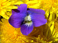
Irisby photom1946Comment: Comment from the Critique Club;
mmm - A flower shot - very dificult to get scores UNLESS you have a realy exceptional shot. This is due to the the thousands of shot out there.
I think the fact that you did not have enough yellow in the shot had a big influence on the voting. A closer crop or an extra yellow flower would've helped.
I ilke the DOF in this shot. That you did good.
Image seems a bit soft - One thing to remember on challenges at DPC is that the voters love Clear,crisp,sharp colourful images.
|
| 05/07/2006 04:50:31 AM |
Negative Thoughtsby singerboyComment: This is a comment from the Critique Club;
Ahoi - I see this is your first challenge entry. Don't worry about the score - learn from it. My first entry came second last and had a score of 3,3.
Your image, well - it does seem a bit grainy. Check your ISO - read up on it.
-The angle of the shot is OK, but check the crop. Alot of detail (statue hand etc) was lost during cropping.
-Use rule of thirds for composition.
-Focus is of - Try sharpening your images using Unsharp mask - worked wonders for my shots.
Don't let your score discourage you. Ask questions in the forums, look at the challenge history, read up and study AND practise.
Remember that voters at DPC like clear, Sharp colourful images. Learn how to get yours like that.
Good Luck. |
| Photographer found comment helpful. |
| 05/07/2006 04:37:11 AM |
Tunnel Visionby david1707Comment: This is a comment from the Critique Club;
I see this is your second entry and already you are improving. Good work - keep it up.
This one is very interesting. What does the original look like? You might have gotten a few low votes due to people not knowing what it is. With something like this, try and compose your title in such a way that it adds a little bit of explanation.
There seems to be a lot of white in your photo. This tells me that the original was very dark. My suggestion - Take the original, make it B&W, Make it a bit lighter, bump up the contrast and then turn to negative. |
| Photographer found comment helpful. |
| 05/07/2006 04:31:01 AM |
Humble Beautyby Joy MooreComment: This is a comment from the Critique Club;
Hi There
Let me tell you what I like;
-Great detail
-Very nice colours
Basically a nice flower shot.
Unfortunately for a flower shot to do well, you need to have an exceptional shot due to hundreds and thousands of flower shots out there.
-Composition is a bit off - try not to have the purple flower in the centre.
-The one petal on the purple flower is out of focus.
-The pollin doesn't do it for me - Would've like to see a nice purple flower without the pollin.
-Try Sharpening it a bit.
Please remember - this is my opinion. Use what you want; discard the rest. |
| Photographer found comment helpful. |
Home -
Challenges -
Community -
League -
Photos -
Cameras -
Lenses -
Learn -
Help -
Terms of Use -
Privacy -
Top ^
DPChallenge, and website content and design, Copyright © 2001-2025 Challenging Technologies, LLC.
All digital photo copyrights belong to the photographers and may not be used without permission.
Current Server Time: 04/12/2025 05:26:50 AM EDT.