| Image |
Comment |
| 12/18/2009 10:23:23 AM |
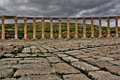
The Decaying city of Jerasaby ahmadbaaraComment: Neat subject and repeated geometry. The ominous sky is also great. However, the lighting is very flat, so there's not a lot of variation in tone. Also, I might have cropped out more of the foreground, as it's not that interesting. Also, it seems like the image was maybe oversharpened? |
 Photographer found comment helpful. Photographer found comment helpful. |
| 12/18/2009 10:20:32 AM |
|
| Photographer found comment helpful. |
| 12/09/2009 04:17:51 AM |
|
| Photographer found comment helpful. |
| 12/09/2009 04:17:07 AM |
Dog's Lifeby kewzooComment: Nice. If it were advanced editing, killing the branch in the upper left would have made it even better. |
| Photographer found comment helpful. |
| 12/09/2009 04:15:59 AM |
Francisby shetlandComment: This is a really wonderful portrait -- love the detail, tones, lighting, the variety of color, and Francis's position (turned foot) -- but it doesn't use the technique. The lighting is clearly behind the camera, not the subject. |
| 12/09/2009 04:14:07 AM |
Light Pinkby lyn100Comment: I love how the way you lit this makes the rose look like it's made of glass. Really great effect. |
| Photographer found comment helpful. |
| 12/09/2009 04:13:36 AM |
ANGKORby andrewtComment: Oustanding sky and neat reflection in the water. |
| Photographer found comment helpful. |
| 12/09/2009 04:13:03 AM |
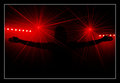
...and then there was light...by Eagle40Fox2Comment: Neat! No idea what this is, but I like it. Really nicely cropped and good definition on the hands. I love how some of the lasers (?) pass in front of the arms, and some behind. |
| Photographer found comment helpful. |
| 12/09/2009 04:11:24 AM |
Gasworksby franktheyankComment: A really nice shot. Very grim feeling, with the low, cold sun, and the graffitied tanks. The lens flare actually enhances the image. I might have cropped less tightly in the upper right so you get the whole tank, but you may have not had that option. Again, overall, I really like it. |
| Photographer found comment helpful. |
| 12/09/2009 04:09:20 AM |
London Contre Chevalby MArteSiComment: Neat idea, but I think the image could benefit from a different composition. The centered horse makes the image feel a bit static, and rather than framing the horse, the branches creep into it. |
| Photographer found comment helpful. |
Home -
Challenges -
Community -
League -
Photos -
Cameras -
Lenses -
Learn -
Help -
Terms of Use -
Privacy -
Top ^
DPChallenge, and website content and design, Copyright © 2001-2025 Challenging Technologies, LLC.
All digital photo copyrights belong to the photographers and may not be used without permission.
Current Server Time: 04/12/2025 09:17:39 AM EDT.